Kiko n. 336 + Lovely Color Mania n. 117

| | Comments: (10)

BLINDING pictures, I know, but it's not my fault :>

As always, my poor little camera can't catch all colours properly, and dark-yet-bright inky blues represent a fight between what reality is and what my camera sees :D

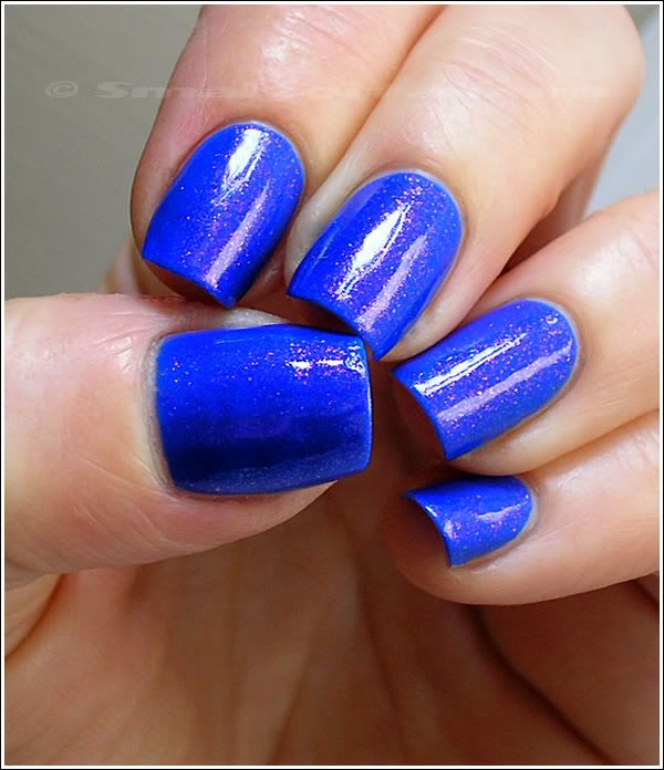
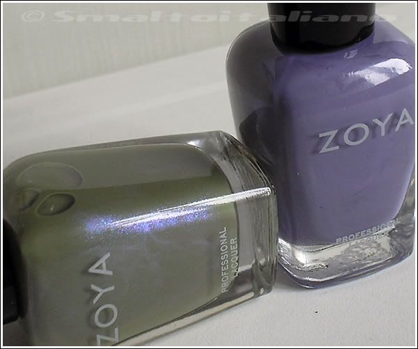
This is two coats (and ½, just to cover residual bald spots) of Kiko n. 336 plus two coats of Lovely Color Mania n. 117, a blurple jelly packed with pink (and green when angled) fine glitters.
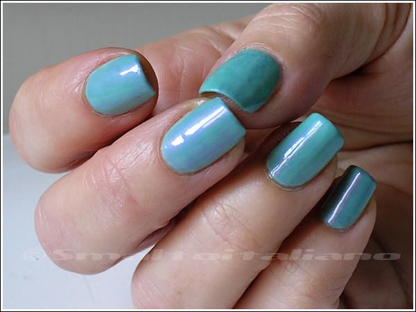
Result: PURE LOVE.

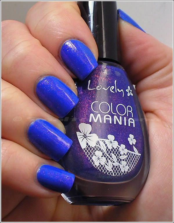
Sabbatha gave me her bottle of this little gem in our first swap, because I fell in love with it the same istant I saw it on her blog (thank you, you're so kind ^_^), and now that the sun finally is showing up, I decided to use it!

In the daylight:

AS ALWAYS, my camera pick these kind of blues too lightly, so next pics are the closest to reality I can show you.
It's like with Orly's "Royal Navy": to the naked eye, it's dark yet bright, very ELECTRIC, but in pics it's lighter and more vibrant.

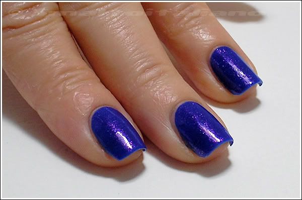
Direct artificial light:

Kiko n. 336 is a tad lighter than the base of n. 117; n. 117 contains duochrome glitters - see the green in the low right corner of the bottle? ♥

This is n. 336 alone, it's called "Blu elettrico" and I can say it's REALLY violently electric!

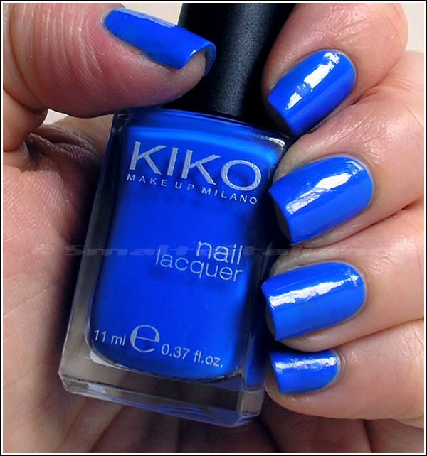
With n. 117 on top, which is a tad purplier, it becomes more vivid (if possible) AND darker.
I know you know what I'm talking about...
You just had to imagine this mani as dark and blurple as the bottle I'm holding in the next pic.

(daylight)

(full sun)

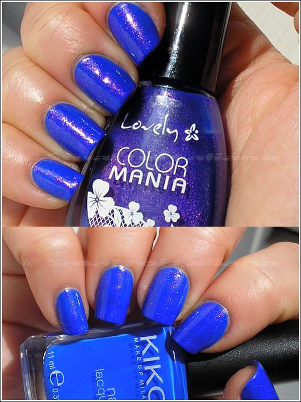
Formula of n.336 is a little runny and I had difficulties during application, so clean-up required much more time than the other manis, but in this case... Who cares :^D


EDIT about wear: 3-4-5 days without particular problems, I just had some chips because of nail's peelings.


Have a nice day/night/whatever and thanks for your attention ;¬)

Gosh - Holographic

| | Comments: (7)

Lol, after you'll read post's title, I know it's perfectly useless to add more words, so I'll let pictures do the dirty job for me :D

I just decided to wear it because of the sunny days we HAD - because now it's gray again *grrr*
So... In full sun:


EDIT: forgot to put this one...
Direct artificial light (♥ ♥ ♥):

BUT it was a nice surprise to see how much colorful "Holographic" is in shade/lowlight too!
Look at those indoor pictures:

I LOVE how rainbow becomes of neon pastels here:


I don't have any of the special bases you'd need with holo polishes, so clearly application was a nightmare, but just the first coat.
I applied two coats over my usual base, then top coat, then another coat of Gosh, so holo effect didn't get dulled by it :>

What else to say? Come back, Sun, I need you!


Have a nice day/night/whatever and thanks for your attention ;¬)

Latest Kikos and Essences: swatches and comparisons - pt. 2

| | Comments: (8)

Hi again :>
Here they are the other swatches and comparisons, those are all Kikos.

First section is about teals: I have to say that now I know my camera can't pick those kind of colour properly, as seen in this post, so I had to tweak pictures to show you actual colours of polishes, I'm sorry.
That's why you see the sepia background (upper half group shot) and my skin burned-like :D (lower half, shot on the right).

I remember I was craving for Rimmel's "Sky High" so much, I got it (just because I went to Bruxelles) and clearly Kiko decided, not long after, to do a VERY similar colour... Which I bought it anyway.
In fact, I didn't know it was THAT similar, but on nails it's a different story:

No base coat, no top coat.
N. 342 was two coats, SH needed three, n. 341 two coats.
N. 342 and 341 are heavy pigmented, while SH is of a lighter formula and sheerer, I didn't expect it.

N. 342 is a tad darker too, and to the naked eye is a little more evident, so it's ok to have both in my stash.
N. 341 is way bluer than the other two, not so blue like it appears from pictures, but a true medium-dark teal. Awesome.

Next batch was full of work, for me :D
It was difficult to get some similar colours - in fact, they're pretty different from each other - and I tried various combinations.
Moreover, camera, as always (especially mine), got confused with all these shades of lilac, and I had to take several pictures in order to obtain decent shots with the ACTUAL colours!

I choose to combine these well known polishes with Kikos to show you how they are compared to them, I had no idea how to do it in an another way, sorry :^/

Then, I tried swatching Kikos with the most similar polishes:

No base coat, no top coat.
All two coats.
"Cashmere Cardigan" is the dustier of the group, "Liberty Girl" is the darkest.

In these shots - dont' know why (no, I know it: my camera sucks a little) - all colours look bluer, but they're true lilacs, and I just can say that they're pretty different once you put them on your nails: wait, did you notice that I say that almost for everyone of the new Kikos? They change hue from bottle to nail, especially the lighter colours! Trust me, I'm not crazy, but it's a little frustrating...
You put bottles side by side, they look almost dupes, and then, once you've applied them, they totally change!

See it in the next shots too!
Look at n. 338: on the nail is brighter -.-°

No base coat, no top coat.
N. 338 and 337, two coats, n. 339 three coats - it's wayyy sheerer :^/
N. 339 is a dusty mix of lilac and periwinkle ( = ♥), while n. 337 I think is like the China Glaze's "Grape Pop" (maybe, I don't have it), even if in the pictures above - again, grrr - it appears bluer.

Maybe do I have to stop making swatches and comparisons before having a better camera? :¬D


Have a nice day/night/whatever and thanks for your attention ;¬)

Latest Kikos and Essences: swatches and comparisons - pt. 1

| | Comments: (8)

First and LAST time doing those typical swatches - you put on a varnish, take pics and then remove it, and go on with the cycle :D -, I mean, how could you girls do it so easy? It takes a looooot of time!
Anyway, result is pretty useful, I think :>

I decided to split swatches in two posts, to avoid the avalache of pics, so you'll see soon the second part.

I started comparing two duochromes I immediately imagined very similar each other: well, they are, but fortunately not so similar.

Fontana Contarini n. 75 and Essence "Where's The Party" are both purple/green duochromes, so I put them near to spot differences:

Angled shot in full sun - front shot in full sun - in shade.

No base coat, no top coat.
FC was two coats, WTP needed three.
FC has a blue base and green shimmer, which became strong gold/lime in the sun and angled.
WTP is a grey base full of shimmer which is purple on front and blue/green in the sun angled.
Shade pic shows they're pretty different :>

Next comparison: Essence "Choose Me!" and "Out Of My Mind".
I said before they have the same colours, but different finishes and effects:

Angled shot in full sun - front shot in full sun - in shade.

No base coat, no top coat.
CM! was two coats, OOMM three.
See the pink/purple duochrome of OOMM in the angled shot? Very pretty.
It's so luminous even in shade, like a green glow.

Last for this post, two blues.
Nihrida asked for swatches and possible dupes for my last Kikos, so I did my best to find similar colours in my Helmer - and, to be honest, it was difficult, at least that means I buy wisely :^D

These are Kiko n. 336 and H&M "Blue My Mind":

No base coat, no top coat.
Both two coats.

Look at the first shot in the upper half of picture: even to the naked eye, when you place them side by side they look almost dupes, but on nails they aren't anymore: n. 336 is deeper, darker and brighter than BMM. So glossy too.
I LOVE blues, so I'm satisfied, no dupes here.

Second part will be published soon :>


Have a nice day/night/whatever and thanks for your attention ;¬)

For your viewing pleasure...

| | Comments: (8)

... Here you have the newest Essence releases! (well, there are more of them, you already know it...)

Yesterday I decided to take a walk despite the thunders, bolts of lightning and the massivest amount of rain I ever seen in the last years.
I was just having a look at Essence display (in search of the "Whoom Boooom" collection) when I suddenly realized there were some new colours and, obviously, I couldn't leave them in the store :D

I found some of the new pastels, but my attention was grabbed by two bottles in particular, I bought them by chance, without knowing they were the two most wanted new Essence duochromes!

N. 43 "Where's The Party?":

Instant love.
Well, I know that sometimes promo pics don't have to be too much reliable colour wise, but this is how Essence represents "Where's the party?" on the site:

LOL WUT

Anyway, here you can find a comparison, "Where's the party?" looks a perfect dupe of Zoya "Ki", which I don't have - but was always curious about it.
Seems to be similar to Gosh's "Purple Heart" too, even if it isn't compared to it in that post...
Whatever, it's enough for me to call it a must-have :D

Next one, n. 52 "Out Of My Mind":

which I call the shimmery twin of "Choose Me!".
They have same colours, but "Choose Me!" has flecks in a jelly base instead of fine shimmer.

As you can see from my angled shot, there's a little pink/bronze duochrome, very nice, but again I don't see any relations with the promo pic:


They added too much colours :D

As said before, you probably already know Essence added new colours, toppers, glitters, etc., etc., etc.
I didn't find them yet in that store, but now I know that when I see new stuff in a store, I have to check other retailers in the city, so tomorrow I'll probably take another walk - in the sun, I hope! - and make a little treasure hunt, I already compiled a wishlist :D


Have a nice day/night/whatever and thanks for your attention ;¬)

Kiko - n. 340

| | Comments: (8)

Colours's choice courtesy of my boyfriend :D

Usually I never wear a polish I bought not long before (don't know why...), but this time I made an exception, especially because we are having GREY days, with rain and wind, so I decided to wear a blue sky on my nails.

N. 340 IS the colour of a bright spring sky, don't you find? Beautiful :>

Easy application for a pastel: two coats, no streaks, acceptable time of drying, few corrections with brush and remover... Nothing to complain about it, seriously!

Just one curious thing you can see better in the next pic: in the bottle it's much more lighter than on nails!
I mean, polish in the bottle, to the naked eye (mine, at least :D), is a perfect baby blue, but on nail it's brighter and a little deeper.
That's ok, I don't care :D


Sometimes I like to add a baroque touch to my look :¬D

EDIT about wear: it lasted several days and it chipped only on some nails because they were peeling a little underneath, but... It STAINS!
Maybe it's so well pigmented that it leaves colour on nail surface too, I don't know, but that happened, and I had base coat too... Long removing work!


Have a nice day/night/whatever and thanks for your attention ;¬)

Number increasing...

| | Comments: (10)

... Number of my nailpolish bottles, of course :D
Here they are my new adds.

A couple of weeks ago Kiko decided to add 40 new shades to the regular collection of colours, but these new adds are limited editions, even if Kiko didn't communicate a "date of expiring", so I guess they'll sell them until stock runs out :D

Given that new shades are primarily pinks, aquas, mints, dark blues and purples, I tried to GRAB my favourites from the group as soon as I could, and this is my haul:

N. 342, 341 (maybe I inverted first two, I don't know :D), 340, 339, 338, 337, 336.

Aaahh, these are all colours I wanted from long time!
I know they aren't particularly original, but italian world of nailpolish doesn't offer so many choice, especially from the cold side of rainbow, so I'm really happy with them :>

Camera took colours pretty faithful to reality, but I isolated drops from the Kiko's site* (in reverse order compared to my picture) to show you how they are, differences are subtles...


♥ ♥ ♥

(*) drops taken here.

It isn't finished yet!
Can you recognize them? :^D


Yeah, "Gemma" and "Caitlin"! How beautiful they are?


Have a nice day/night/whatever and thanks for your attention ;¬)

Renewed Burt's Bees Lemon Cuticle Butter

| | Comments: (3)

I bought my first tin of Burt's Bees last year, and after almost exactly one year I'm running out of it, so I got another one, and I discovered that they changed its formula, primarily thanks to the smell: it isn't so lemony anymore, but sweeter and sugary... Not for me at all.

Tin's design too it's a little different (new version on the bottom), it's sturder and it closes a little easier than before.


Ingredients of previous version were:

Sweet almond oil, beeswax, lemon oil, cocoa butter, tocopheryl acetate (vitamin E), candelilla wax, sunflower oil, rosemary leaf oil, tocopherol (vitamin e), beta carotene, vegetable oil.

New version has a couple more ingredients, but clearly proportions of them have been rethinked, because smell it's noticeable different:


Nothing bad, I suppose, they're all natural components as always; but I liked the lemon scent so much, too bad :>


Have a nice day/night/whatever and thanks for your attention ;¬)

H&M - Peppermint Fusion

| | Comments: (5)

Hi there :>

My current mani - but it will die soon :D - is this lovely shade by H&M, "Peppermint Fusion"; perfect dusty blue with cornflowery blue shimmer.

As much as I like this colour, I must say that formula is really bad: thick, it dries slowly, and it needs three coats, or two with many corrections on bald areas, like I did...

But it's so beautiful!


In shade...


Full sun again.


Because of its thickness, polish chips easily, especially if you accidentally hit something.
It lasted several days on me though, just with acceptable tipwear.


Have a nice day/night/whatever and thanks for your attention ;¬)

Swap calls another swap :D

| | Comments: (7)

Another little swap arranged with the lovely Zygzak, who's a reader and friend of Sabbatha :>
She saw this post on her blog and immediately fell in love with that green, so she asked me to send her a bottle (plus a couple of Kikos), in exchange of some of my greatest lemmings: oh yes!

Result? I got not only three of my lemmings satisfied, but she was so kind to add three, VERY yummy, extras :D

1) Golden Rose n. 307: purple-blue glittery duochrome, I won't add any further comment :D

2) Sally Hansen's "Purple Pizzazz", if you are here, you know this better than me :D

3) Safari n. 265, GREEN with gold shimmer - but i see some glitters too; she wrote me it's a dupe for China Glaze's "Moonpool" - which I didn't know, but from what I read it's a well known shade...

4) Jumpy n. 143, purple glitter! These little cute bottles are adorable.

5) Sally Hansen's "Garnet Lapis"...

6) ... and "Turquoise Opal" = ♥ ♥ ♥

What else can I say? Just another "thank you" to Zygzak, it has been a pleasure ;>


Have a nice day/night/whatever and thanks for your attention ;¬)

Eyeko - Vintage Polish + Revlon - n. 986 Ultra Violet

| | Comments: (4)

Finally I'm here :D

From my last manicure, I stayed three days without nail polish on nails because I couldn't choose a colour... I know that this happens to YOU too, my reader :D

Yesterday I finally had an idea about layering two polishes, so I did my manicure and... I don't like it at all :^(
But strangely pics came out waaaay better than reality, so I'll explain later why I don't like the result.

In shade:


Direct sun:


Base polish is the infamous "Vintage" by Eyeko: now I officially hate this one.
This is the second time I use it, but I already used 1/3, because it needs three coats to get an even surface; it thickens too with time (I mean, during application), don't know why; plus, I had to redo two nails, because of this behaviour. I remember from the first time I wore it that it was one of the most durable nail polish - on me, obviously -, but I can't recall such a bad formula, so maybe it got worse by then...


On top of "Vintage" I put "Ultra Violet" from Revlon, an oooooooold polish I saw in The Nailphile blog and later found on eBay.

This is a triumph of chemical stuff - it will kill your nose -, and it's extremely sheer, but I LOVE its violet flash, so I thought it would be a good idea to layer it, and I tried.


Now, I absolutely don't know why, but to the naked eye my nails are HORRIBLE: "Ultra Violet" is sheer, but its base is lavender coloured, and you can totally see it on top of "Vintage" in all its STREAKY and PATCHY GLORY.

Can you spy patches on my nails in the next pic? They almost don't appear in pics, so imagine them 10x times worse, and you'll understand why I already hate this combo.
In the sun, that violet flash hides unevenness, but in low light...
At least, i must say that from far (and to a non-nail polish freak like us), these colours are nice and wearable.

Just a last question: is "Ultra Violet" a shimmer or a pearly polish?


Have a nice day/night/whatever and thanks for your attention ;¬)