We all know that nail polish used to have the same formula of car paint, right? Today they still have so much in common, beside the fact that cosmetic industries are trying to delete and/or substitute toxic ingredients. Good for us.
I like to look for strange colour pictures (of cars, animals, clothes, etc.), and years ago I discovered
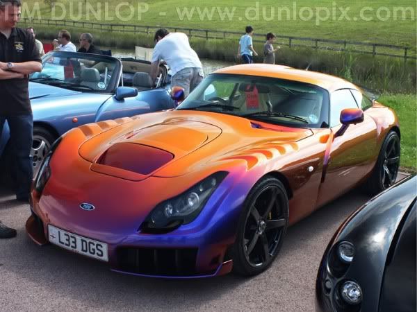
TVR, an English car company whose cars are often painted with terrific shades.
So I was browsing web in search of interesting car pictures, and I stumbled accross forums of car-modding: I just noticed that men are EXACTLY like us when we talk about nail polish
:^D
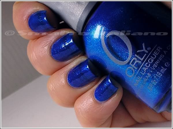
I mean, you can find the ones with classic taste colour - in this case: racing orange or yellow or even red paints; then we have the majority, who likes blue, and finally there are men who literally
drool over unusual shades, heart-shaped eyes emoticons included too, * lol *
I stole images from
these forums, where you can spy them acting just like us on colours, shades, finishes, sun or no-sun pics, macro shots, shimmer (even if they call them flakies)... And nail, sorry: car art too! Look at this:
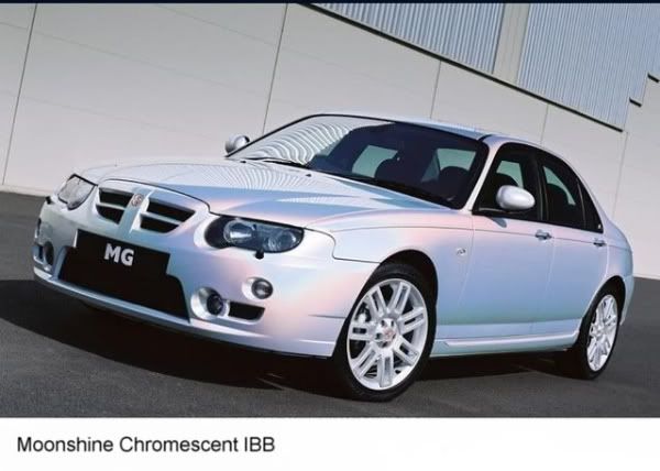
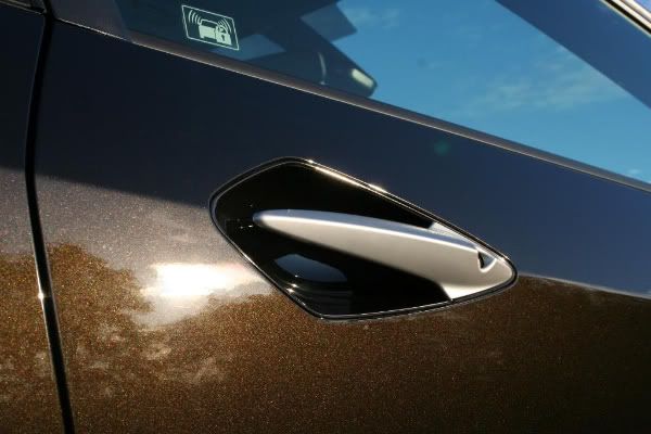
If you browse those forums, you'll find men appreciating all these particular colours, like this pearly iridescent white:
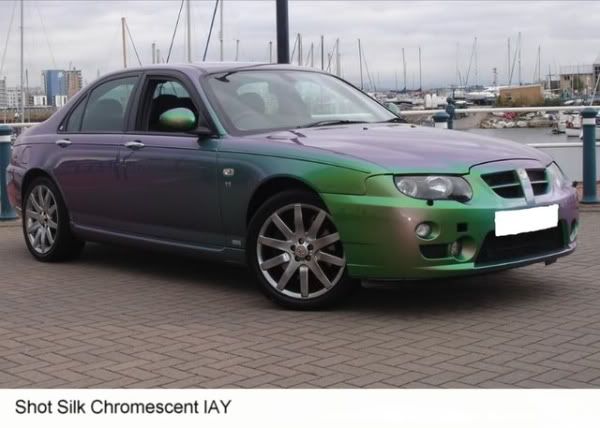
and (drumroll):
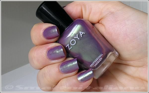
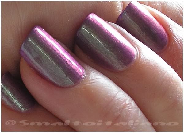
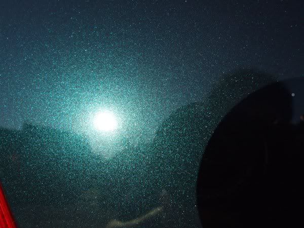
duochromes! See:

I WANT a polish like this:
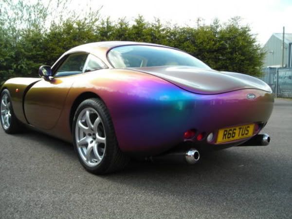
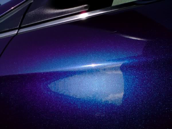
and THIS ONE: it's a TVR in "Cascade Indigo" paint... Wait, I must insert a drool face *___*
Same finish:
Yeah, I know, there's Ozotics...
What about "Chameleon Green"? (again: *___*)

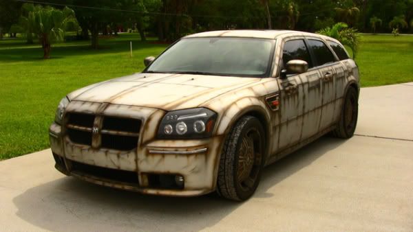
But you can even find a mat black...

a Wagon Trail-esque...
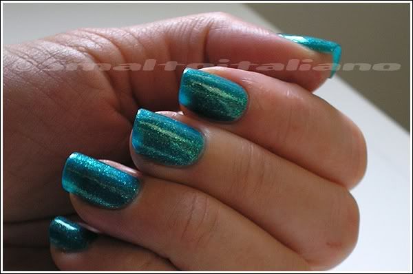
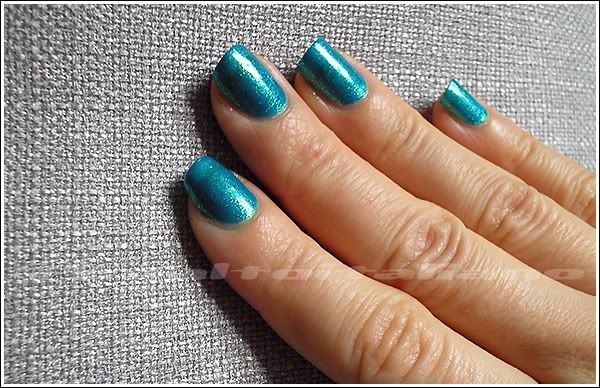
Viridian-y... ? (or something from ultimate fall collections, I can't recall it...)
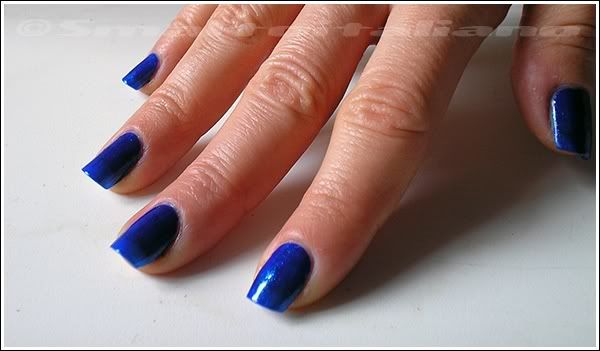
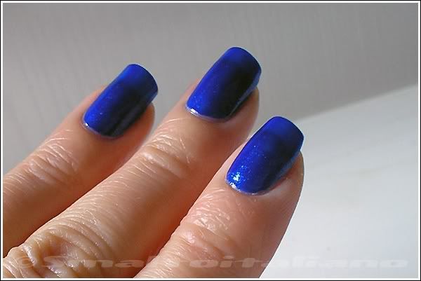
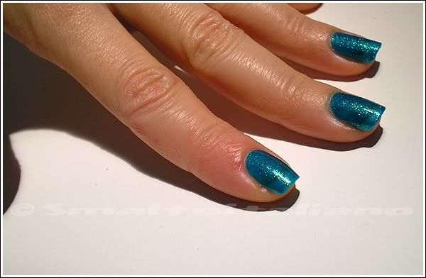
Almost "Royal Navy", indeed * lol *
Who knows how many shades are waiting to be brought to us from car paints world? I see gorgeous combination ;>
Have a nice day/night/whatever and thanks for your attention
;¬)


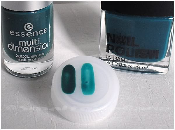
 It's not so original, but Essence's quality and Essence's prices beat almost everything :D
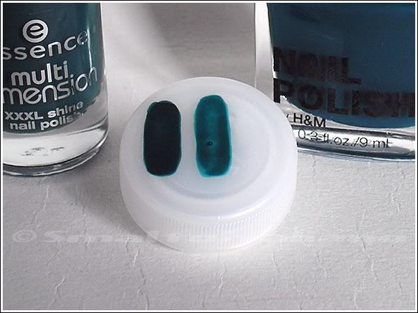
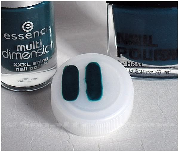