Essence - Trendsetter

| | Comments: (5)

Yesterday I chose to wear a flat creme and obviously today the sun is shining in all its majesty...
You'll see, next manicure which will require full light (because of the colour, or the decorations...), it will rain black ink and it will be almost night at 10 AM.

Anyway, this is - I know you haven't guess it yet - "Trendsetter" by Essence.
Not much to say about it: two easy coats - on pinkies I got full coverage with just one coat - and one coat of top coat. It's thickish, but flows well.
On nails it's a little darker than in the bottle, at least on me :>

(greasy zones are veils of cortisone cream, cold sometimes gives me snake skin on some areas ;>)


This is a shot on black, to show you it's light enough to always appear green:

It's not so original, but Essence's quality and Essence's prices beat almost everything :D


Have a nice day/night/whatever and thanks for your attention ;¬)

Zoya - Adina

| | Comments: (8)

Hi all :>

This week I chose a polish I really liked from the first time I saw it on other blogs.
Not much to say about colour, pics speak for themselves.
I just noticed it's a polish which screams "spring!", not just for the reflects - generally, direct light doesn't enhance well duochrome -, but because I think it needs much more light around it and of a better quality too: autumn and winter morning sun is usually dull and not so bright as the one of spring and summer.

These are two coast plus some touch-ups to even out some bald areas.


This is how polish looks most of the times:


And last pic shows the pink-bronze side of this beautiful duochrome.


However, I have to say that there must be something wrong in its formula: it's thin and a little runny, dries fast, but it's still somehow dentable after almost two days; it caused some tiny bubbles too on a couple of nails, and I know I'm not the only one who encountered such flaws.

It's a pity, because I love this shade.
I'll surely wear this again, but during a nicer season :>


Have a nice day/night/whatever and thanks for your attention ;¬)

Comparison: Nubar "Indigo Illusion" vs Fontana Contarini n. 75

| | Comments: (3)

Yesterday my beloved "Indigo Illusion" from Nubar arrived home :>
How much I wanted this one from the first time I saw it? I don't know, but now I own it and immediately thought about this comparison, since reflects of both looks so similar - but not THAT similar.

Duochrome is the same, purple with light at right angle and green from perspective; colour base, instead and fortunately, is pretty different, as you can see from first pic.
These are one coat each one:


And these are two coats each one:


"Indigo Illusion" is a little greener, more of a teal shade, while n. 75 is a dusty blue. Good thing!

I took this angled picture just to show you that duochrome is pretty the same, but I guess that on nails, having them a different base, they will not look so close.
On top, "Indigo Illusion" and, bottom, n. 75:


Have a nice day/night/whatever and thanks for your attention ;¬)

Orly - Royal Navy

| | Comments: (11)

Ahhh, I'm really in ♥ love ♥ with this polish...
Not a surprise for me, but it's the first time I wear "Royal Navy" and now I can say it's my favourite of all time. I read many reviews of this polish, and not all are completely positive, but I didn't encounter any flaw, this shade is MY shade :¬D

First of all, this jelly isn't that sheer as it's very pigmented, these are two coats - you have to put medium thick layers, otherwise you'll need three coats of it...


What about colour? See for yourself, it's Blue with capital letter :^D So Blue that sometimes you can spy a violet tint in it.


Shimmer is not dominant, and I like it this way, even if it adds a little sparkling and glowing touch. It's so fine that it seats on bottom of the bottle, so I layed polish on its side during application, and rolled it often to let shimmer spread well inside.


Also, from pictures it looks more sheer and lighter than reality: to my eyes, I can barely see my nail line, because it's inky and opaque, like dark glass.


Unfortunately, here in Milan we're having a very BAD weather, so I'm curious to see "Royal Navy" in a sunny day, I bet it would be stunnier than today. It dries very fast with a satiny finish, so I guess it contains neon pigments, that's why it seems so bright despite its darkness.
Maybe I should buy a backup bottle... ?

EDIT: I added this watercolour sample to show you how many gradations "Royal Navy" has under different lighting. For example, under light bulbs it becomes a deep, dark indigo-Prussian blue, like on the left of the image, and shimmer is barely visible just on spots where light falls. Fascinating!


EDIT about wear: today, november 17th, is the fifth day of wear, and I have just tipwear on some nails; I touched up tips on monday and then put another coat of top coat, so overall aspect is still more than acceptable. I'm satisfied :>
And today we have SUN, this polish is even more gorgeous!


Have a nice day/night/whatever and thanks for your attention ;¬)

Comparison: Essence "Trendsetter" vs H&M "Moody Model"

| | Comments: (2)

Hello there :>
This week I made a little trip to H&M to see their new polishes, and I decided to buy just "Moody Model", a dark teal.
There were another interesting colour, called "No Mambo Jambo", but I thought it was similar to Sinful Colors' "Rise & Shine", which I own: well, it's not that similar, but "Rise & Shine" is enough for me to satisfy my bright-almost-neon-turquoise-teal-with-a-little-shimmer willing :^D

Anyway, at home I realized that "Moody Model" is tragically similar to Essence's "Trendsetter", so here's a comparison for anyone who'd be interested in :>

You can already notice a difference from the bottles, and it's strange, because in reality they look like almost the same colour.
First pic shows one coat of each one,


"Trendsetter" is waaaaaay more opaque, but now you can see that "Moody Model" is a tad bluer.
Second pic is two coats of each one:


Two coats for "Trendsetter" are definitely enough, but it's not the same for "Moody Model"; in fact it requires three coats, so I put a third coat, while "Trendsetter", on the left, is still two coats:


They're not dupes, but very very similar, dark but never "black-looking"; "Moody Model" is thinner and bluer, maybe on nails it will look lighter... I don't know, probably you don't need both of them.
Sorry for the darkness of pictures, they're not as dark in reality, but I don't know why camera kept darkening them.

I have to say that I HATE new cap of H&M polishes, it's totally unmanageable and I really don't understand why they changed it with this stupid shape.
Bottle too is stupid, because I find it's difficult to roll it in my hands, but cap is absolutely ANNOYING.

You know what? I'll use Essence's cap and brush with "Moody Model". Who cares about a beautiful shape when Ergonomics si compromised?


Have a nice day/night/whatever and thanks for your attention ;¬)

Essence - High Waist Pink (and a little bit of nail art)

| | Comments: (7)

Hi all :>
This week, loud manicure! And pink too... Unbelievable.

Anyway, as might you have guessed from the title, this is "High Waist Pink" from their TE "Denim Wanted!", BRIGHT pink which a tiny tint of coral too. Formula is between a creme and a jelly, it's very shiny on its own.

Pics have been taken indoor, so I had to play with them to obtain the real colour, and being almost a neon polish, camera had problems; in exchange, my skin looks a little dead, but it's not that important, in real life polish appears just as you can see in my pictures :D


Noticed something? I decided to add a touch of I-don't-know and placed flakies of an iridescent plastic film I bought in Fontana Contarini shop - I already explained they sell everything you might need for nail art.
Aren't these beautiful?


It didn't take me too much time: I applied first coat of polish on all nails, let it dry, then applied second coat of polish on one nail, and, when still wet, I placed flakies one by one with a damped toothpick. In the end, I sealed manicure with two coats of top coat. That's all!
Easy and fun :>
I had to try them on different coloured bases - blues, purples, black...


Flakies on their own are slightly lavender tinged, I love them. Now I want to return to shop and buy other colours...


EDIT about wear: thanks to the double coat of top coat, manicure lasted very well, only today (november 11, 6th day of wear) I got my first chip.


Have a nice day/night/whatever and thanks for your attention ;¬)

Comparison: Nubar "Peacock Feathers" vs Fontana Contarini n. 75 vs Rimmel "875 Zeitgeist"

| | Comments: (6)

Good morning/night :>
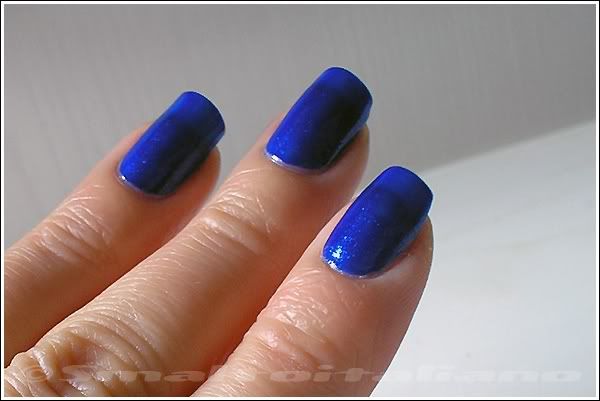
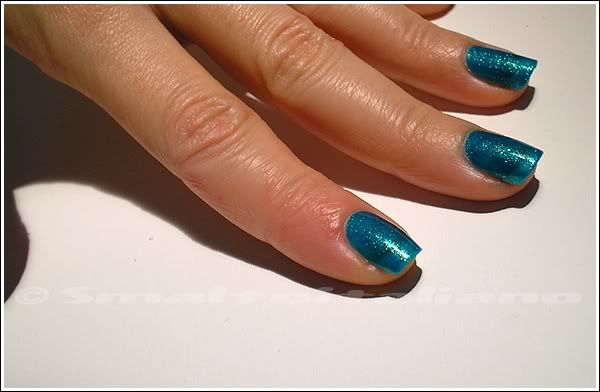
You already saw this colour previously, hope you liked the way I like it.

Since I'm in love with all strange polishes, I try to collect them - and wear them :¬D
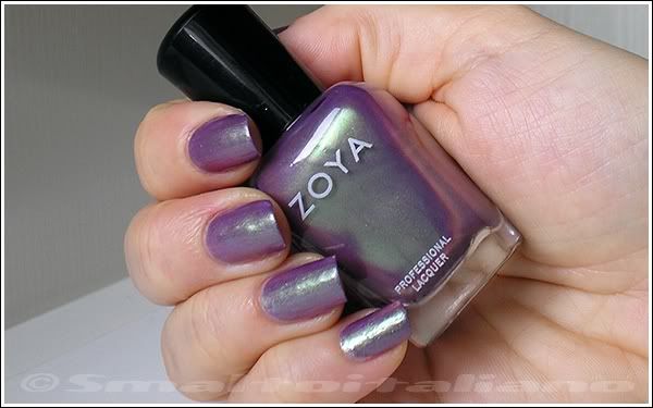
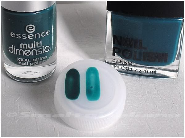
After buying n. 75, I was curious to see what's the difference between it and "Peacock Feathers", who has the same oil-slick finish, so I put two coats of each on my trusty plastic cap and got this:


I'm glad they're not close: even if their colour structure is the same - blue/teal base full of duochrome shimmer - final result is different; "Peacock Feathers" is darker and definitely blue/purple, while n. 75 is somewhat between a lavender and purple.

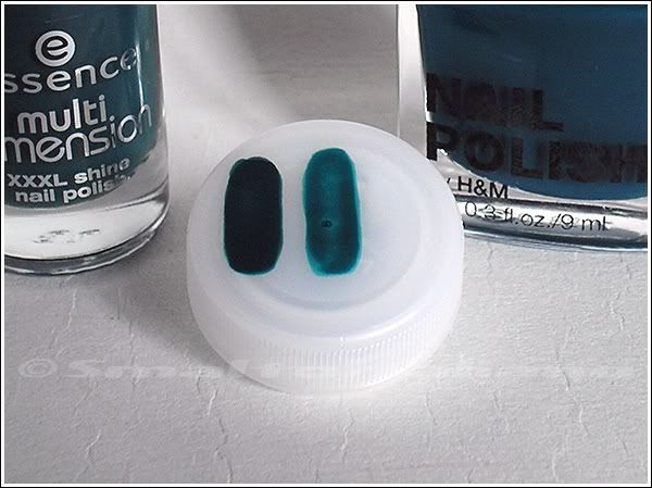
Then, I saw another ANCIENT polish of mine - I bought it years and years ago - by Rimmel, which is called "Zeitgeist" ("the spirit of the age", in German), and appeared very similar to n. 75, they both have a rainbow in the bottle :>

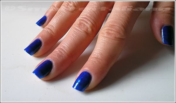
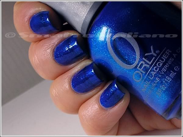
So I put one coat of "Zeitgeist" on the white cap and here you can see the result:


That old Rimmel polish was meant to be perfectly opaque with one coat, and so it is still today - maybe it tickened a tad more with age (ok, it was like GLUE), but I have thinned it a little, so I don't care -, but I discovered it isn't a dupe for n. 75, as it's more rusty/copperish.

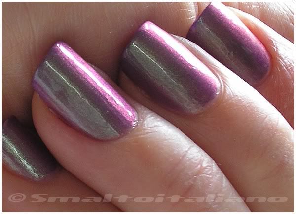
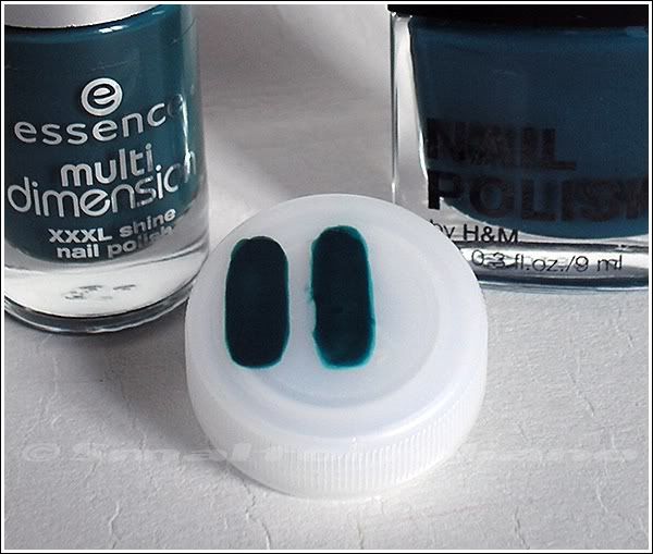
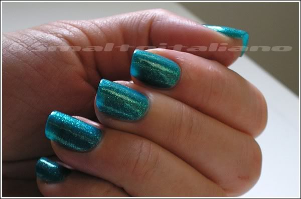
However, being a duochrome, it changes colour with angle, so next pics show you all the variations you can see, and you'll notice all three polishes are well distinguishable from each other!


Different greens, and different purples.


How could you not love them?
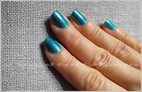
Last pic shows better the opacity of all polishes: while you can spot the blue base in "Peacock Feathers" and n. 75, "Zeitgeist" is dense and creamy.

Rimmel bottle is just 8 ml, but it's so covering you need just one coat.
I googled it, and found it's still available - even in the new design -, don't know where though, but you can find some swatches here and there (this particular swatch is pretty recent too).


Have a nice day/night/whatever and thanks for your attention ;¬)

Essence - Choose Me!

| | Comments: (6)

It's now time for a polish you've never seen before on your screen, but given that here in Italy we always arrive late to party, I am now able to show you the 3764er dupe of the EXCLUSIVE Orly's "Halleys Comet" - so exclusive I suppose they had to steal the pigments from Zoya's strongbox in order to make the Cosmic FX collection...

Nothing much to say, this is two coats and ½, or ¾, I'm not sure: I put two coats, then something less than a third coat to even all out. Let's say that three coats are the right amount of polish.

Under the sunlight:


In shade:


Against the light:


In shade, but darker:


I must say that I prefer it in shade, because colour is richer and so deep, and you can see much more sparkle diffuse on the nail; bright or direct light obviously make it sparkle to the maximum level, but polish get more flat.
It's a jelly, but I like it and I don't bother about VNL. Very beautiful.
So beautiful I bought three more bottles after the first one, so now I have 20 ml about of this shade :^D

EDIT about wear: fantastic wear, just a little tipwear after five days at least.


Bonus pic for Nihirida: me too I have a cat mug... Sad cat is blue :^D


Have a nice day/night/whatever and thanks for your attention ;¬)

I wasn't even interested in this collection

| | Comments: (5)

So what are they doing in my house? I dont know, maybe I have a polish disease... In fact I liked them when I saw them in person.


From left, "My Boyfriend's Jeans", "Forever Mine", "High Waist Pink".

Picture really didn't captured "Forever Mine" well, it's so vivid and I can't say how that colour it's named in English; in Italian, is turchino, which has nothing to do with turquoise ( = turchese, in Italian) and it's completely different from azzurro (tipically the colour of a clear, deep sky), maybe can I say it's a deep blue? VERY, very deep, and bright. Wow.


Have a nice day/night/whatever and thanks for your attention ;¬)