Girlish pinky pink today (°_________°), I know, not something you see often here...
Showing posts with label Rimmel. Show all posts
Showing posts with label Rimmel. Show all posts
Rimmel - 60 seconds n. 405 Rose Libertine
at 15:30 | Posted by Smaltoitaliano | Comments: (7)
Hello!
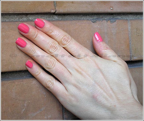
Girlish pinky pink today (°_________°), I know, not something you see often here...
Girlish pinky pink today (°_________°), I know, not something you see often here...
(outdoor daylight, washed out...)
But seems like I like this hue of pink, isn't it? :D
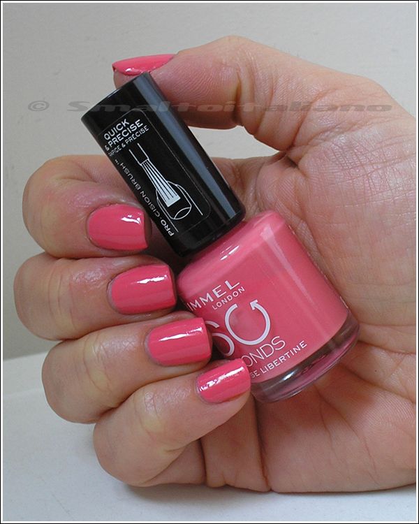
"Rose Libertine" is a lovely warm pink creme (a tad warmer in reality than in my pictures), feminine and easy to wear, I like the contrast between its sweeetness and my usual way of clothing (much more strong-looking :D ).
(indoor daylight)
Don't know why (but I know it happens sometimes), it's a little darker on nails than in the bottle, maybe it's because of bottle's shape and material.
Brush isn't flat, but I didn't have problem with application.
(indoor day-lowlight)
I love it, in lowlight is bright and full, not flat and dull, and I use it whenever I want a neutral tone, but I don't want to use a skin-coloured nailpolish.
Have a nice day/night/whatever and thanks for your attention ;¬)
Last new buyings of 2012
at 10:38 | Posted by Smaltoitaliano | Comments: (8)
Looong post today... better start NOW :D
Sinful Colors!
Don't know why, but SC finally decided to import more interesting shades here in Italy, here's my first two picks:
Sinful Colors!
Don't know why, but SC finally decided to import more interesting shades here in Italy, here's my first two picks:
Left: "Kissy", right "Blue By You".
I made some quick cap swatches and a little comparison:
1) "Blue By You"; in these pics, bottle shots is true to life: it's an electric blue base with turquoise, mmh, flecks? Don't know how to call this kind of shimmer, it's grainy. Instant love.
2) Essence "Choose Me!", compared with 3) "Kissy": they're very similar, as you can see "Choose Me!" is sparklier, that's why it looks greener. Maybe Probably you don't need both :D
Next, it's a great Pupa shade from their Déco Christmas collection:
This is n. 811, the "green" one, but as yu can see, it's not only green ♥
Since that I'm a true professional swatcher, I've even made a gif :D
(on the nails, Q by Colour Alike n. 118)
Golden-sage green to purply-bronze, how much awesome is that? Too much.
(almost sun)
Sinful Colors again :D
This is the famous "San Francisco":
Honestly, this is simply GREAT :D
It's green, but it has also a strong blue side, look at the cap swatches.
Bottle appearance it's pure green in real life (like the left swatch), but pictures captured more of the blue you can actually see, don't know why :D
Anyway: COOL.
Ok, let's change brands.
A while ago, Shaka released a collection which you can surely recognize as inspired by something else well known...
Being Shaka distribution a true disaster, almost no-one saw them in real life, I only eyed CH2 "Purple", and CH3 "Emerald", which I bought.
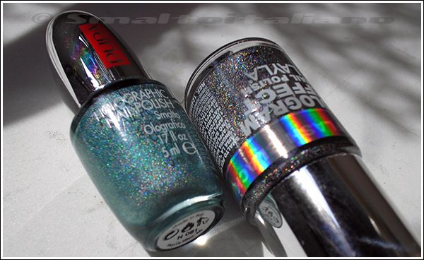
On the right, another Astra Holo, n. 708 ♥
They're both super-pigmented; "Emerald" isn't the most original green-teal-goldish reflects you can find on the market, but we're sick, and we buy things we like in multiples :D
Last two brands (with swatches!), Rimmel and Catrice.
"Rock Royalty" by Rimmel is darker and deeper, has some purple sides and a beautiful shimmer I can't define at this moment :D (looks pink...)
Actual awesomeness is the left Catrice shade, a new one: "Steel My Heart".
Nailpolish bottle cap says this colour has a "brushed metal effect", and you can see from the cap swatch that it's true: "Steel My Heart" is a mat bronze metal nailpolish, honestly I've never seen a finish like that and I like it very much!
Two coats on the cap without top coat.
Maybe it recalls the OPI suede finish? I don't know, I don't own any of them, but this is GREAT, you can notice the colours of shimmer, blue, purple, green, pink...
I bet it'll be stunning with top coat!
BUY IT, if you can.
If I remember correctly, there's at least another "brushed metal effect", more on the blue side, but it was a little too grey for my tastes...
Last Catrice, a gold one, "Oh My Goldness!"
Yes, I bought a true gold, but, hey, this is molten gold in a nailpolish bottle.
Swatches show the shimmer, this varnish is a clear base with micro gold shimmers, VERY shiny, rich and precious.
Uff, what a marathon, if you read all this post, you really like me :D
Have a nice day/night/whatever and thanks for your attention ;¬)
Latest buyings :>
at 23:49 | Posted by Smaltoitaliano | Comments: (8)
... I mean, latest from June and July.
Pupa n. 032, bought when Pupa put holos and others on sale, and Layla "Flash Black", brought to me (at a lower price) by Stregalice <3
H&M "Fantasy Ocean", still don't know if it's the tenth teal-with-gold-shimmer I own...
Next, the new Shakas: together with the holos, Shaka released some "collections": the only one I could recognize is the one dedicated to planets, but honestly I don't know the others - and I repeat, Shaka's site is awful.
Anyway:
Anyway:
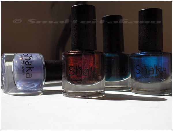
Shaka n. 660 "Ternder" (spelling mistake, I suppose :D), n. 670 "Deep Passion" (look!), n. 775 "Forever Green", n. 860 "Universe" (the one in the "planets" collection).
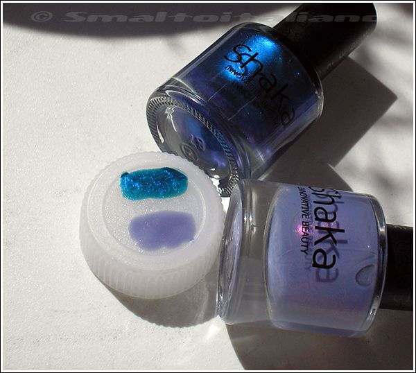
These colours are to die for, so I decided to make some cap-swatches:
These colours are to die for, so I decided to make some cap-swatches:
N. 860 "Universe" has a dark teal base with electric blue shimmer *_*
N. 660 "Ternder" has a beautiful and glowing pink accent in a lavender base; a little watery, though.
Next, the masterpiece, in my humble opinion:
N. 660 "Ternder" has a beautiful and glowing pink accent in a lavender base; a little watery, though.
Next, the masterpiece, in my humble opinion:
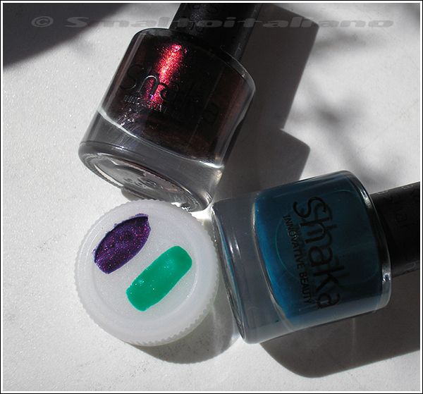
N. 670 "Deep Passion" has a blue base and DEEP red shimmer, I BET this will be STUNNING once on my nails <3 <3 <3
N. 775 "Forever Green" looks teal in the bottle and grass green on cap, but I've discovered it's a blued green jelly: here I put just one coat (quite saturated!), I think two coats will be enough and more similar to bottle's colour, even if not so dark.
Next, thanks to a blogger whose name I can't recall now, I bought the polish on the left straight after I read her post on Rimmel's "Night Before" :D
Since that I already own "Blue Me Away", I decided for a small comparison:
"Night Before" is darker and less blue, while "Blue Me Away" is absolutely blue °_°
Shimmer (which is lightly duochrome, by the way) is the very same, I think, only inserted in a different jellish base.
Last, random picture :D
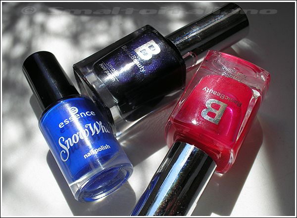
Some lovely italian girls send me "Grumpy" from the Snow White Essence LE, you all know how much I love electric blues <3
And I picked a couple of Basic Beauty for me, there were an offer on all the makeup items...
Last, random picture :D
Some lovely italian girls send me "Grumpy" from the Snow White Essence LE, you all know how much I love electric blues <3
And I picked a couple of Basic Beauty for me, there were an offer on all the makeup items...
N. 76, the purple one, is VERY dark, very vampy.
N. 67PE, is a magenta PURE jelly (picture show it lighter). Yes, it's the third pink jelly from BB I own, I'll do a comparison in the future when I'll come back home.
BB, why don't you make more colours in jelly formula? :°°°
Have a nice day/night/whatever and thanks for your attention ;¬)
N. 67PE, is a magenta PURE jelly (picture show it lighter). Yes, it's the third pink jelly from BB I own, I'll do a comparison in the future when I'll come back home.
BB, why don't you make more colours in jelly formula? :°°°
Have a nice day/night/whatever and thanks for your attention ;¬)
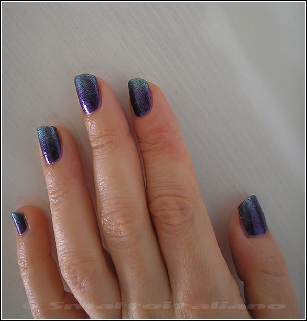
Gradient: Rimmel - Pompous + Eveline - n. 464
at 09:50 | Posted by Smaltoitaliano | Comments: (11)
Ahhh, at last I tried a gradient :D
First of all, my tools:
First of all, my tools:
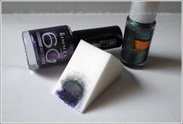
- Makeup sponge, which will give you the smoothest result;
- the colour chosen for your base (Rimmel "Pompous");
- the second colour, my choice was this thin Eveline I received from Sabbatha ♥
(demi-shade)
Maybe not the best result, clearly, it was my first time with the makeup sponge, but I'm satisfied, and I'll retry it with cremes.
(daylight, outdoor)
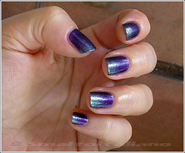
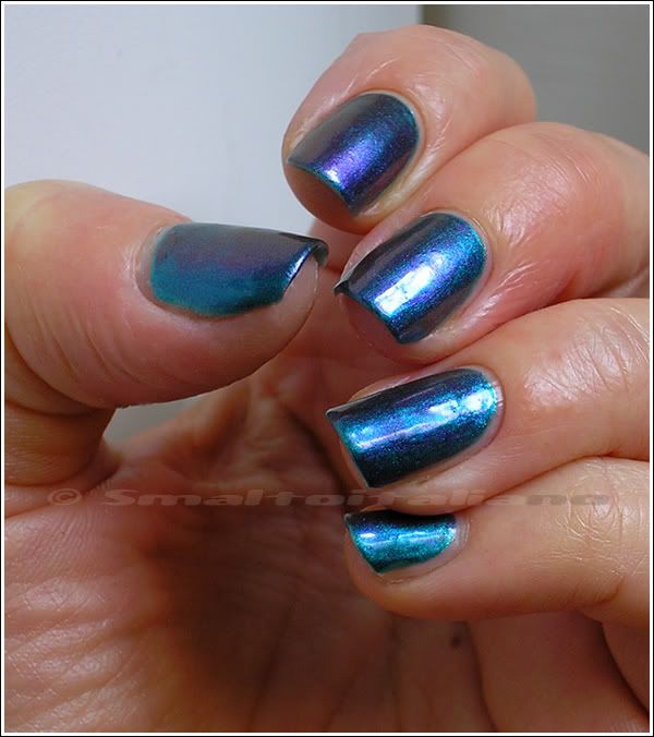
Some pictures are colder than others, just because I took them in different light conditions, and you know that purple is particularly sensitive and changes under different light sources... In outdoor locations, purple reflects the blue sky, so does the green part, that's why sometimes it appears teal.
But next picture is the most true to life colour wise:
(daylight, indoor)
What about a shot of the whole hand?
I think it looks pretty good, even if my nails aren't that long :>
(daylight, outdoor)
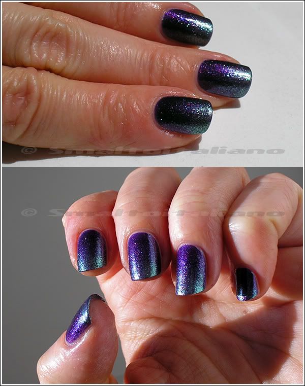
I chose shimmery/glassflecked varnishes, so you know I think they look at their best in shade or indoor lightings, but here's some full sun pictures:
Sparkly, dark and coloured at the same time :>
After almost two days I got some small chips here and there, don't know why, anyway I kept this many for four-five days, it wasn't that bad-looking :^P
Have a nice day/night/whatever and thanks for your attention ;¬)
Rimmel - Pompous
at 10:11 | Posted by Smaltoitaliano | Comments: (5)
Purple again!
I must be in an unconscious purple spree, since that I wore it three times in a row :D
Anyway, this nailpolish was a complete surprise for me: I bought it because it was on sale, and I didn't notice anything special in this purple until I saw it on my nails.
Look at pictures and keep in mind these are two coats without top coat *_*
(direct sun)
In the bottle looks like a good old shimmery deep purple, but on nails it's sooo vampy, yet shiny and lustrous.
(daylight)
I love the large brush, it almost avoids me the clean-up part ♥
(daylight, a little bluer than the actual colour)
Don't you love the darkness at the sides and the colours of the shimmer in the center?
(full sun)
So, my verdict: highly recommended, it applies easily, covers perfectly in two coats, dries quickly.
Have a nice day/night/whatever and thanks for your attention ;¬)
May flowers
at 15:40 | Posted by Smaltoitaliano | Comments: (8)
Welcome back in my blog (to me!) :D
This time, for those who love nailpolish bottles pictures and info, here's a feast for your eyes :>
From left:
- Pupa Holographic n. 039 "Taupe". Bought for wearing it at a wedding, but then I opted for the "Violet" one, n. 035 (not pictured, blogpost will be up soon).
- Models Own "Indian Ocean": you really need description? :D
- Basic Beauty n. 50PE, electric glassfleck blue, just like this one :> (maybe a tad darker?)
- Another berry jelly from Basic Beauty! This is n. 70PE, first one (n. 68PE) I showed you here.
Rember this multichrome Layla? It has the same colours of "Indian Ocean", so I tried layer two coats of it under one of "Indian Ocean", this is the result:
"Indian Ocean" is sheer, you already know it, but with a nude base you can wear it alone without problems, two coats are anough.
To be honest, I tried it over dark bases too, but didn't photograph it, sorry.
Next, here we have my two new jellies, and a little comparison :>
(n. 70PE on the left, n. 68PE on the right)
Strange thing is that the lightest jelly covers better than the darker, I put two coats of n. 68 and three of n. 70.
Anyway, they're so pretty, you can use them as bases too ♥
Then, we have two lonely pretties:
- Rimmel "Pompous", a shimmery purple (bought because it was on offer :D );
- H&M "Aqua Splash", clear base with aqua coloured microglitters. I like it!
Below we have two Essies: Essie began selling nailpolish here in Italy in some different beauty stores around Italy like a month or two ago, but I got these bottles in two different places.
First one is "Dive Bar": look at it! Deep teal-purple duochrome, I know it will rock on my nails even if purple won't show up completely *________*
I bought because I loved it, but I spent €11,90 >.<
Second one, one of the bluest blue I own: "Aruba Blue"; bought few days after, for €5, at a charity sale :D
Another pictures of them and swatches on cap! Two coats of each.
Aaaand... a pop of PINK :D Hot pink, properly speaking.
I got these two Pupa neons thanks to Elsa, who find them at a lower price, and since that I'm on a neon spree this spring...
(pink one laid over my latest pink buyings :D)
In details, plus swatches on cap, two coats of each:
- pink one is n. 052;
- purple (not so purple, you see), is n. 053.
Last, my de-doubled Essences!
For those who still don't know it, you can easily separate double nailpolishes simply by pulling bottles, one in each hand.
Thanks to Stregalice for this trick :>
Have a nice day/night/whatever and thanks for your attention ;¬)
Labels:
Basic Beauty,
blue,
comparison,
Essence,
Essie,
glassfleck,
glitter,
HnM,
jelly,
Layla,
Models Own,
multichrome,
neon,
new adds,
pink,
purple,
Rimmel,
shimmer,
taupe,
teal

Rimmel - Green With Envy + Ozotic - n. 504
at 07:23 | Posted by Smaltoitaliano | Comments: (3)
Picture heavy post this time, sorry in advance if this is a bother for any of you :^/
First of all, I like layerings, they're fun and make me use my polishes a LOT more than just simply slapping them one by one every week :>
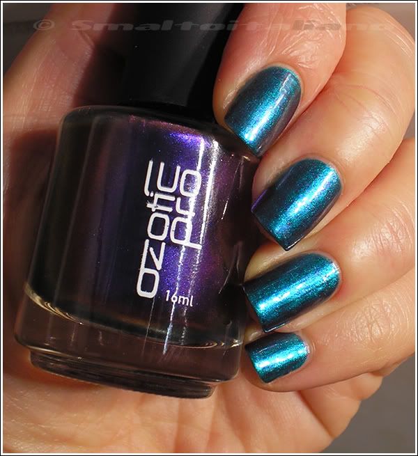
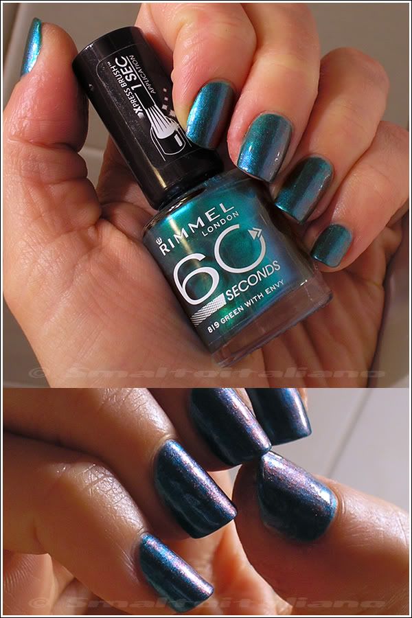
These are three coats of "Green With Envy" plus two coats of n. 504:
Same here, but in artificial light, it was SO dark outside in the morning...
This combo was born totally random because of... lacking of time :D
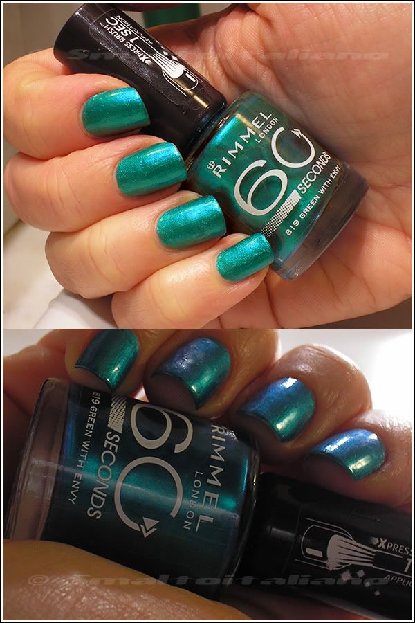
One sunday evening (well, night), I decided to apply this Rimmel, which is a BOMB of aqua-emerald metallic green polish; problem is that it requires at least three coats (so sheer!), and it dries very slowly: result, you get bubbles >.<
Here it is "Green With Envy" on its own, bubbles and everything :D
Another shade so hard to picture: it's a tad greener in real life, but you can see it has a blue side too. ♥_♥
I wore it alone for a day, but I hate bubbles, so I tried to cover them up with something else; so why not to choose a multichrome polish?
You don't always had to wear them over a black, they're AMAZING over lighter colours too!
Next two pictures are just one coat of n. 504, how beautiful?
N. 504 lays a purple veil over the green *_*
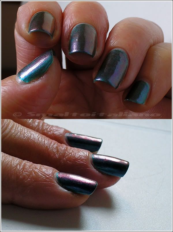
But remember n. 504 is a multichrome, from purple to orange/gold, look at those colours!
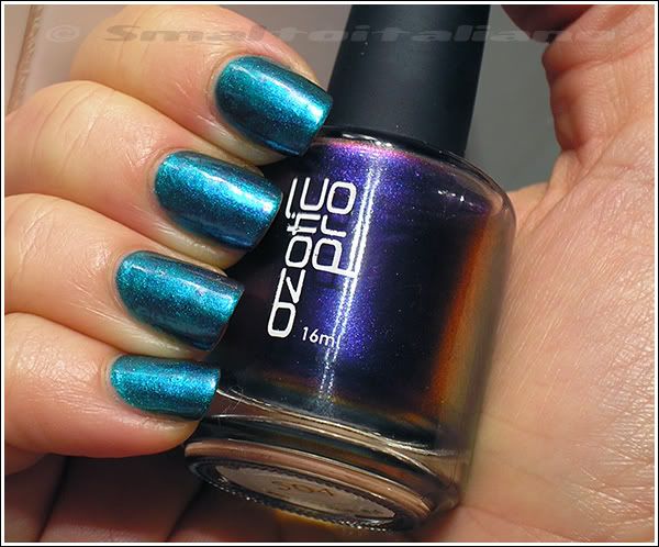
After two days, I decided to add another coat of n. 504... Perfection!
Here I managed to capture all the colours, it really has that oil slick appearance on surface and it's even way more visible to the naked eye!
It changes a little from indoor lighting to outdoor, indoor is deeper and much more intense, outdoor (overcast) it shows more colours:
 Unfortunately, sun didn't show up too much these days, I bet this would be fantastic in full sun, but, oh well, I'll retry it in spring.
"Green With Envy" alone is a great colour, just be sure to have some time to let it dry well in between coats :>
Have a nice day/night/whatever and thanks for your attention ;¬)
First of all, I like layerings, they're fun and make me use my polishes a LOT more than just simply slapping them one by one every week :>
These are three coats of "Green With Envy" plus two coats of n. 504:
This combo was born totally random because of... lacking of time :D
One sunday evening (well, night), I decided to apply this Rimmel, which is a BOMB of aqua-emerald metallic green polish; problem is that it requires at least three coats (so sheer!), and it dries very slowly: result, you get bubbles >.<
Here it is "Green With Envy" on its own, bubbles and everything :D
Another shade so hard to picture: it's a tad greener in real life, but you can see it has a blue side too. ♥_♥
I wore it alone for a day, but I hate bubbles, so I tried to cover them up with something else; so why not to choose a multichrome polish?
You don't always had to wear them over a black, they're AMAZING over lighter colours too!
Next two pictures are just one coat of n. 504, how beautiful?
N. 504 lays a purple veil over the green *_*
But remember n. 504 is a multichrome, from purple to orange/gold, look at those colours!
After two days, I decided to add another coat of n. 504... Perfection!
Here I managed to capture all the colours, it really has that oil slick appearance on surface and it's even way more visible to the naked eye!
It changes a little from indoor lighting to outdoor, indoor is deeper and much more intense, outdoor (overcast) it shows more colours:
 Unfortunately, sun didn't show up too much these days, I bet this would be fantastic in full sun, but, oh well, I'll retry it in spring.
"Green With Envy" alone is a great colour, just be sure to have some time to let it dry well in between coats :>
Have a nice day/night/whatever and thanks for your attention ;¬)
Addicted to cool tones
at 10:10 | Posted by Smaltoitaliano | Comments: (11)
Did you ever notice I preferably wear blues, purples, greens et similia?
No? :D
Well, this is my latest weeks' haul (bottles weren't purchased all at one time...):
 1) Kiko n. 333 "Viola Brillante" ("bright purple"), is this maybe the italian version of China Glaze's "Grape Pop"? RBL's "Mismas"? I don't know, but it's really bright, yet dark, to sum up: love ♥
2) Essence "Style Me Holo": holo wtf, as usual with Essence (the more they call "holo" a polish, the least it is so), but... look at the picture! From the Nails In Style LE collection.
Later I'll show you a swatch, together with...
3) Catrice "Houston's Favorite", from the Out Of Space collection.
4) Essence (again?) "I'm A Marine Girl", from the 50's Girls Reloaded LE collection, just arrived in Italy!
Bottles of this LE are all of 15ml!
5) Deborah n. 36, a long time lemming (I made me a present): maybe it's not so evident from the pics, but it's super beautiful: eggplant purple with not-so-sparkly fine teal shimmer.
6) Essence (are you tired of it?) "Hello Holo": don't know what to do with it, but I liked it in the bottle, I'll surely find a way to use it, for example, like this (*) :D
7) Rimmel "Green With Envy": finally Rimmel brought us in Italy those colours, I had to search for them in Bruxelles to find the shades I fell in love with! (even if there wasn't "Blue Me Away", a HUGE lemming of mine...)
For my italian readers, I found the (little) stand in an Oviesse, located in a IperCoop.
The brilliance of that shade! Looks like metallic jade molten and bottled ♥
If someone out there is interested in any colour in particular, I can swatch it without problems, by now I give you a comparison between "Style Me Holo" and "Houston's Favorite", because they look so similar (maybe Cosnova recycles formulas?), but they aren't, in the end.
They're both in the same type of colour and finish, duochrome from dark blue-green to pink/purple, but "Style Me Holo" has a much more pronounced effect, while "Houston's Favorite" is darker, a little (just a little) more pigmented and less duochrom-y.
Some details (lol, I like to take pics of bottles):
 And here's the comparison:
 Two coats each.
"Houston's Favorite" gets just a bluer tone when angled, but "Style Me Holo" actually changes colour to a purple, so if you're looking for a subtle effect, get Catrice, otherwise the Essence one is amazing.
The addiction continues...
Have a nice day/night/whatever and thanks for your attention ;¬)
(*) two coats of Essence - "Can't Cheat On Me" + two coats of Essence "Hello Holo"
No? :D
Well, this is my latest weeks' haul (bottles weren't purchased all at one time...):
 1) Kiko n. 333 "Viola Brillante" ("bright purple"), is this maybe the italian version of China Glaze's "Grape Pop"? RBL's "Mismas"? I don't know, but it's really bright, yet dark, to sum up: love ♥
2) Essence "Style Me Holo": holo wtf, as usual with Essence (the more they call "holo" a polish, the least it is so), but... look at the picture! From the Nails In Style LE collection.
Later I'll show you a swatch, together with...
3) Catrice "Houston's Favorite", from the Out Of Space collection.
4) Essence (again?) "I'm A Marine Girl", from the 50's Girls Reloaded LE collection, just arrived in Italy!
Bottles of this LE are all of 15ml!
5) Deborah n. 36, a long time lemming (I made me a present): maybe it's not so evident from the pics, but it's super beautiful: eggplant purple with not-so-sparkly fine teal shimmer.
6) Essence (are you tired of it?) "Hello Holo": don't know what to do with it, but I liked it in the bottle, I'll surely find a way to use it, for example, like this (*) :D
7) Rimmel "Green With Envy": finally Rimmel brought us in Italy those colours, I had to search for them in Bruxelles to find the shades I fell in love with! (even if there wasn't "Blue Me Away", a HUGE lemming of mine...)
For my italian readers, I found the (little) stand in an Oviesse, located in a IperCoop.
The brilliance of that shade! Looks like metallic jade molten and bottled ♥
If someone out there is interested in any colour in particular, I can swatch it without problems, by now I give you a comparison between "Style Me Holo" and "Houston's Favorite", because they look so similar (maybe Cosnova recycles formulas?), but they aren't, in the end.
They're both in the same type of colour and finish, duochrome from dark blue-green to pink/purple, but "Style Me Holo" has a much more pronounced effect, while "Houston's Favorite" is darker, a little (just a little) more pigmented and less duochrom-y.
Some details (lol, I like to take pics of bottles):
 And here's the comparison:
 Two coats each.
"Houston's Favorite" gets just a bluer tone when angled, but "Style Me Holo" actually changes colour to a purple, so if you're looking for a subtle effect, get Catrice, otherwise the Essence one is amazing.
The addiction continues...
Have a nice day/night/whatever and thanks for your attention ;¬)
(*) two coats of Essence - "Can't Cheat On Me" + two coats of Essence "Hello Holo"
Subscribe to:
Posts (Atom)

