Showing posts with label mint. Show all posts

Lovely - Crystal Strenght n. 402

| | Comments: (6)

* coff coff  *

HELLO!

Did you notice by chance I'm quite busy these... months weeks?
Makeup school is a mess, and I must admit it's sometimes (MANY times!) so exhausting, especially if you later have to keep your house clean, cuddle your cat, make dinners, etc., etc. etc. :D

But my love for nailpolishes is still alive and I keep taking pictures of my coloured jewels-for-nails *_*


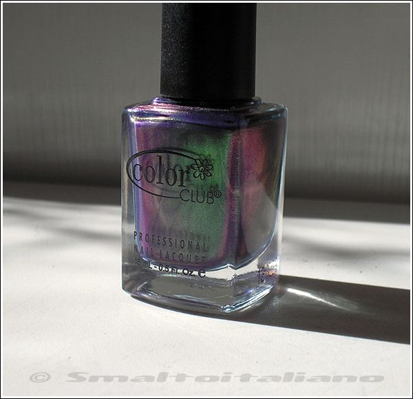
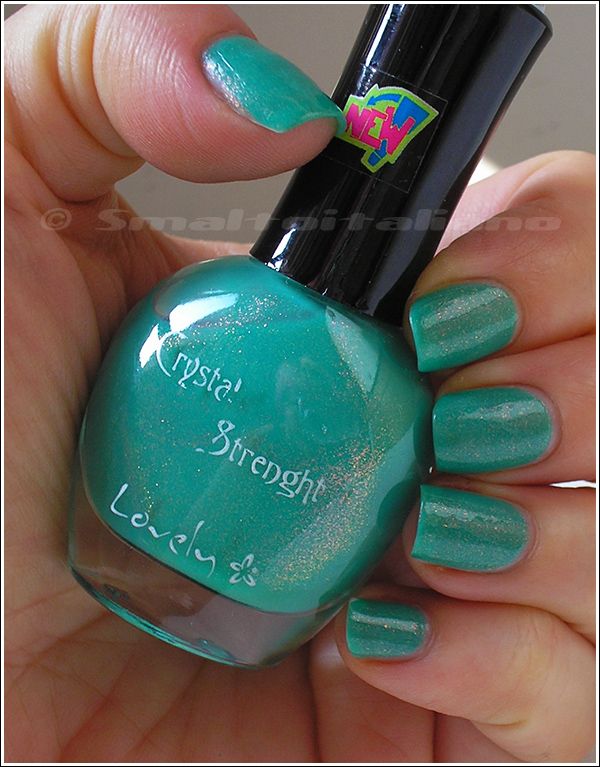
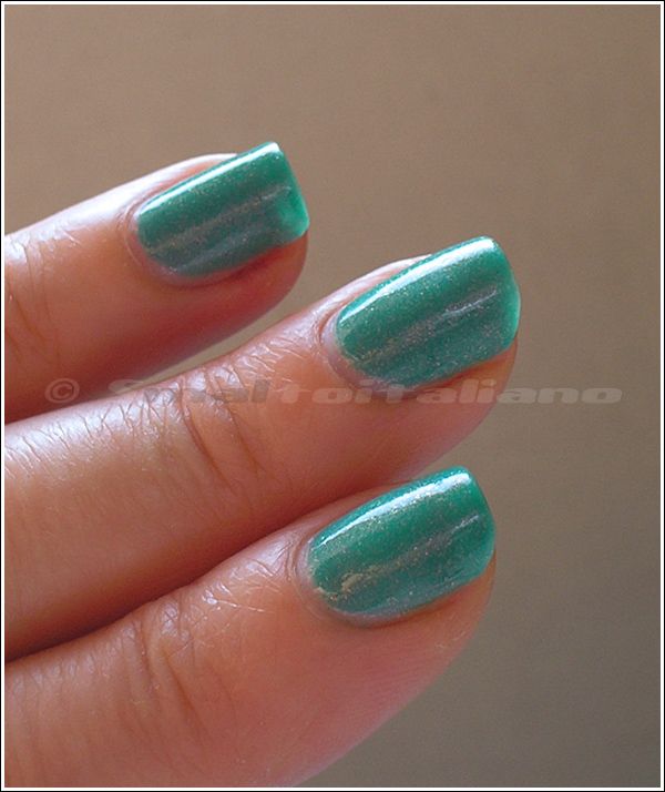
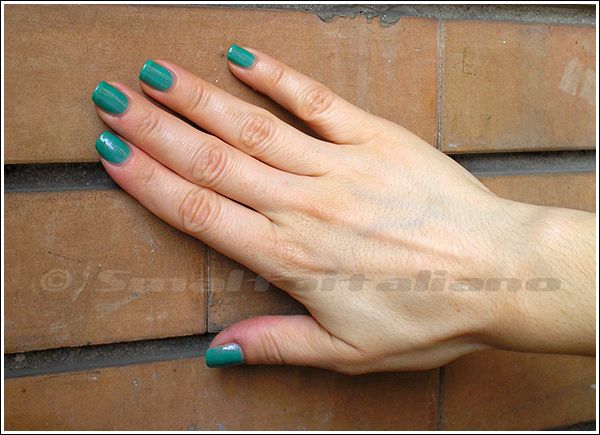
This one is a precious bottle from Poland (who knows who sent me this? :D ), I wore it for a wedding in July 2013, where I had a toned down, so-neutral outift and I needed just a little bright touch on me:


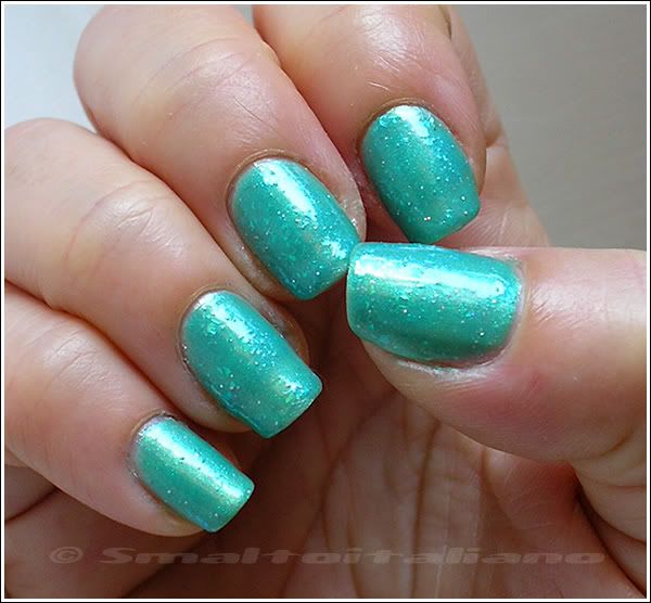
Anyway, this is one of my favourite nailpolishes of all time: jelly seagreeen base, duochrome glassfleck-ish glitters, LOVE at a first sight °_°


See? Translucent nails ♥.♥

I think I applied three coats, not a problem in drying time, I think it also lasted good on me for many days, as I took pics of it after I returned home :>


Nice colour, uh? Fresh and happy :>
Now let's hope to see you more often than every two months >.<


Have a nice day/night/whatever and thanks for your attention ;¬)

Spring new buyings...

| | Comments: (8)

... even if actually we still don't have spring here!

Weather is awful, few days of sun and MANY days of rain, and I'm that person whose mood it's strictly tied up with nice days, sun light and warm temperature. Great choice living in Milan, I guess :D

Anyway, these were the last nailpolishes I got in a long time, since that I then stopped, because I didn't find any other interesting colour...

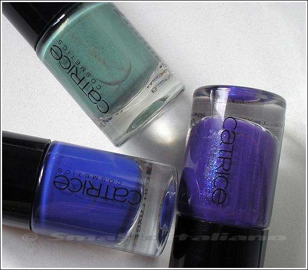
From the new Catrice range, my choises:


From top and clockwise:

- "Mint Me Up", dusty mint with old gold shimmer and glitters, nice combination!

- "Purple Reign": actually it's more purple than in my picture, and it contains blue (and some spare pink) glitters, how can you resist?

- "Shopping Day At Bluemingdales" (short names next time, pls?): not so bright in real life, I've seen electric blue swatches around the web, don't trust them :D
But I'm a sucker for blues, you know, so I really like it, could be a nice choice for anyone who wants a boost of colour without being too much over the top.


Next ones: some time ago, FabFingerTips had a blogsale, and I spied a couple of vintage things I wanted to have in my collection, so here they are!


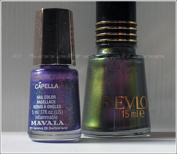
From left:

- Mavala "Capella", I'll talk about it later;

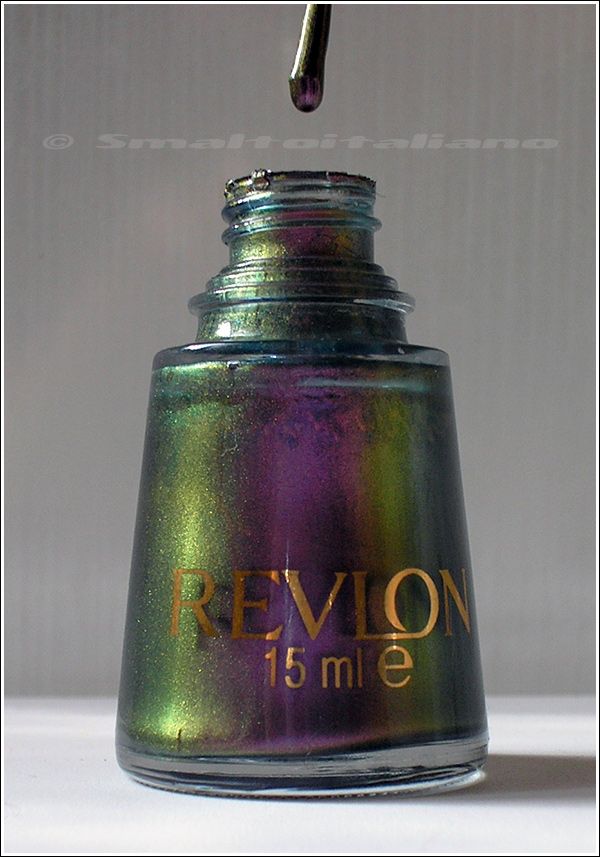
- Revlon n. 490 "Kiwizing", see great swatches here!

I think you all know the (in)famous "zing" collection by Revlon, here's a comprehensive total view (and list) on this collection, which dates from 2000 and it was full of (now older type) duochrome shades!

In the past, Revlon used to make gorgeous nailpolishes (check Color Illusion range!), so when I saw this little gem for sale, I couldn't resist, my inside collector won over me :D


At first I thought it was similar to Nubar "Indigo Illusion", and I think they've somewhat the same formula (see the teal base?), but then I realized the final result is different, as Revlon is a duochrome, and Nubar a multichrome.
I do personally prefer Nubar, but I'm glad I've found "Kiwizing", I'm a vintage-lover and I like to own some older items here and there :D


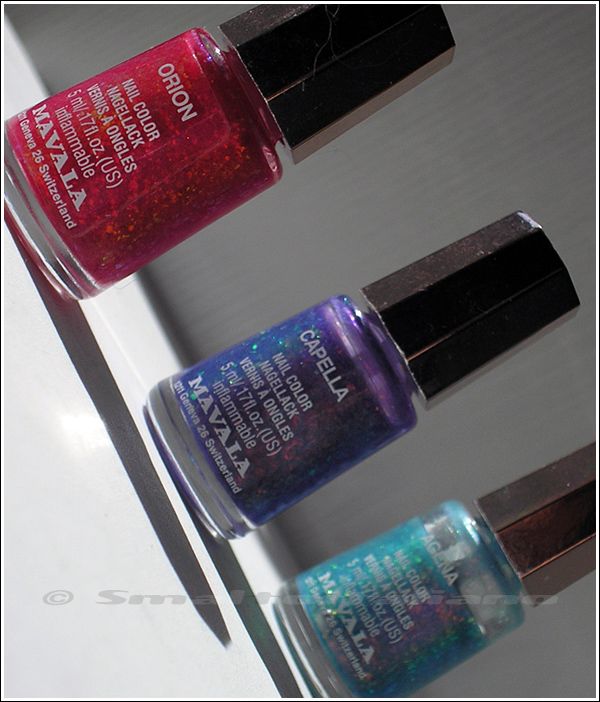
Now it's Mavala turn: I've found "Capella" from FabFingerTips and the very same day, on a british online beauty supplier, I scored another gem from the same collection, "Orion": these are all flakies colours from the Galaxy collection, which is a 2003 SMASHING collection released when no one cared about flakies :D 

The colours were "Agena", "Antares", "Canopus", "Capella", "Orion" and "Vega".
"Antares" and "Canopus" are too milky and frosty for me, while "Vega" has more visible flakies, but it's also milky, so I don't like it :D

I already own "Agena", so now my personal selection from Galaxy is completed!


I know now they aren't that smashing, but I just love these small bottles full of duochrome shimmers and flakies ♥
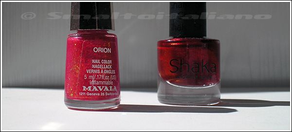
Don't be confused by the base colours, they're all pretty sheer, so I think I'll find the right use for "Orion" even if it's red :D


But, see below: a TRUE RED? Did I buy a RED nailpolish?


Damn yes, but CLEARLY I won't use it alone, don't worry :D
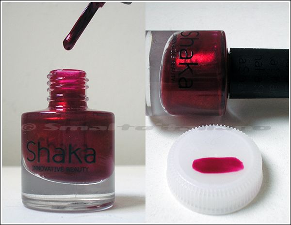
This is Shaka "Burn In Love", very metallic, very pigmented, very fiery! You can spy an orange-gold touch, yes it's there!
Actually "Burn In Love" has a magenta base FULL of goldish metallic shimmer =  RED


One coat.
See? Pink base :> So metallic!

On to the new adds: Elsa bought for me one of the most beautiful colours of this year:


It's beautiful and nice too! :D
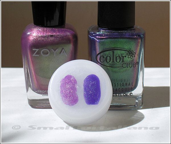
Here it is Color Club "Portfolio" *______________*


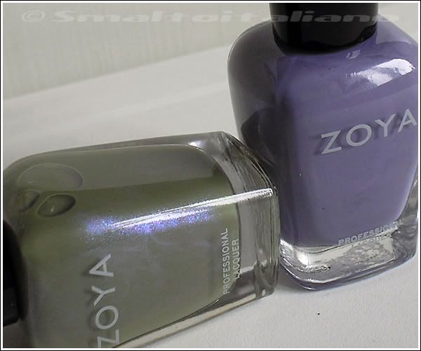
No words needed, if you liked Zoya "Adina", you'll NEED "Portfolio", here's my cap comparison:


One coat each.
They aren't dupes, "Adina" has a lilac base and a lighter green side, "Portfolio" is much stronger, colder and pigmented.
I love both ♥

Lastly, two amazing H&M bottles: "Blue" and "White", clever names :D


El Corazon inspired? Who knows :D


Have a nice day/night/whatever and thanks for your attention ;¬)
New stuff (from august)

| | Comments: (6)

I'm way behind the latest adds, but these are the august ones:


From left: 

- L'Oréal Color Riche n. 609 "Divine Indigo": ok, it's more purple, but it's not a purple, and it's a L'Oréal, a brand I don't like so much; but I've seen swatches around the internet, and I liked it. Me weak :^(

- Kiko n. 389; yes, I've already worn it, a thing I don't do as I don't like trying new colours as soon as I get them...

- China Glaze "Midtown Magic": I found a store in my city of nail and hair supplies, there were stands from some nail companies, and I really liked this odd mix of autumnal shades of fine glitters in a vampy burgundy base... Swatched here by my loved SpookyNails, and I've discovered we bought it almost at the same time, without knowing it! :D

Then, a little package from my Swiss nailpolish fiend:


Left, Misslyn n. 537 "Golden Leaf", gold-old green glitters (or chunks) in a dense dark base, I guess it won't be much sparkly, an interesting finish :>

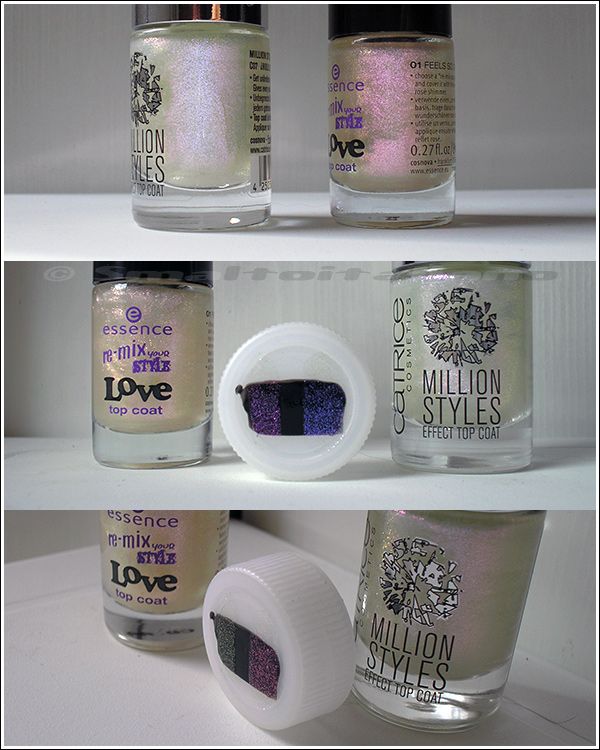
Right, another Catrice Effect Top Coat, "¿Holo Qué Tal?", which isn't holo at all. But it's... sugary, just like another top coat I own, the Essence "Love" top coat, so: comparison time!


Swatched over black.
"Love" top coat has finer glitters, and it changes from pink to green; "¿Holo Qué Tal?" has a bigger grain, and changes from blue-violet to pink (extrem angles, green too).


Have a nice day/night/whatever and thanks for your attention ;¬)
New March things... Again, pt. 2 :P

| | Comments: (13)


Hello again :>

Fortunately I found a little time to write second part, but I have to admit I already have a part three, at least :° :D

Ok, you might have noticed the picture below, so words are useless to us nailpolish fiends:


This is Layla "Green Galaxy" (from the same range of "The Butterfly Effect"), and don't be fooled by the picture, its jelly base isn't teal, but PURE AWESOME green, so green my camera made the hexs a little tealish. ♥ ♥

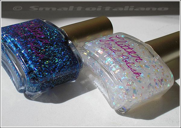
Do you remember I said italian cosmetic world gets better and better lately? Well, finally flakies came here, I imagined a large container of flakies arriving by the sea :D, and many brands picked a part of it; after Layla, now it's the turn of Deborah, which even gave us the blue flakies!!!11


Orange bottle contains our classic orange-green combo, while the lilac one is the blue-green combo ♥

Next, the obligatory purchase :D (just in case you don't have a third or fourth bottle of this colour...) (no, I don't have four, I own the Sephora one only :D ) (two bottles of it é__è )


Catrice "Genius In The Bottle" looks a little warmer from the swatches and comparisons I've seen in other blogs, so, well, technically isn't a true dupe.

But it's Spring! Even if temperature falls from like 25°C to 14°C, I wanted some lighter colour, so I picked these two cheap choises:


Essence "Viva La Green" (a tad darker than Essie's "Turquoise & Caicos", damn!) and NYC n. 264 "Lincoln Square Lavender", which is not a lavender, as you can see if you don't have a disease in your eyes; it's a very nice dusty-but-not-dull cold rose. I like it and wanted a pink like this from a long time!


Have a nice day/night/whatever and thanks for your attention ;¬)
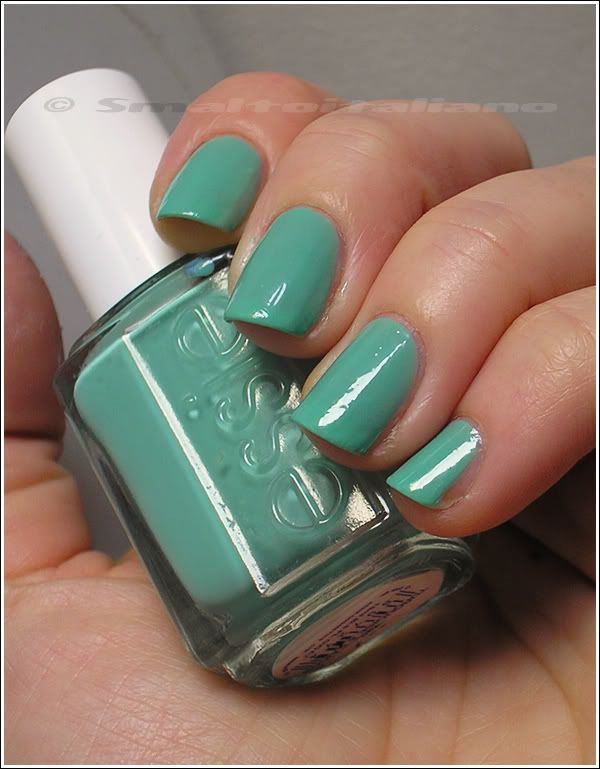
Essie - Turquoise & Caicos

| | Comments: (2)

Can you guess I like spring and I was fed up with all the cold we had in the first two months of the year?

So I picked one of the spring-est colour I can find in my Helmer, received a while ago from my beloved Sabbatha :D

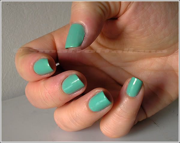
(daylight)

The picture in the post I linked didn't represent the colour as it appear to the naked eye, but you know well how much hard is to take a photo of mints...

This time you can see a true-to-life light pastel minted milk :>
"Turquoise & Caicos" isn't so vibrant, but it looks more saturated on nails than in the bottle, maybe thanks to the contrast against the skin.

What you see in pictures are three coats without top coat - I applied it at night before going to bed, so I didn't have time to do some more :D

Formula isn't the best: three coats to obtain a decent result, and it bubbled a little too on few nails :^/
Maybe my fault, but that's ok, I'll retry it when I'll have more time.

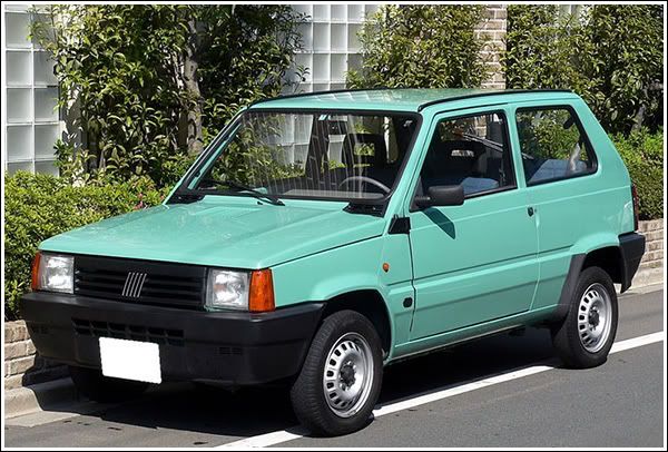
Anyway, I like the colour, but yesterday my man looked at my nails and commented: «That's disgusting, they look like bathroom tiles or the old Panda!» :D
I think he's right...


Have a nice day/night/whatever and thanks for your attention ;¬)
New amazing colours - pt. 2

| | Comments: (10)

Welcome to pt.2 :D

Not only buyings, here, but a swap too: as usual, my nailpolish-fairy Sabbatha gave me some bottles I had in my WL... Must be sort of a nailpolish-mine hidden somewhere in a forest in Poland, and she knows how to extract them :D

From top:

- Sally Hansen "Purple Gala" ;

- Sally Hansen "Mystic Lilac";

- Essie "Turquoise&Caicos" ;

- bonus: NatRobbins "Greed" , well pictured (and compared) here. I guess this would be a gorgeous layering green too, because it's pretty sheer on its own, but gives a great green metallic effect when pur over something else.


Some days ago, I compulsively purchased two beauties from Stargazer which I had pinned in my mind after buying the first two:

These are n. 303 the blue one ("Lunar Eclipse" dupe? I hope so :D) and n. 305 the purple one, I'll leave you just with the pictures :D
They're beautiful, cheap, 14ml and you can find them on eBay.


Then, I wanna try wearing a crackle nailpolish on its own, trying to cover the entire nail; that's because I found this great indigo-with-gold-and-green-irregular-shaped-glitters which I would LOVE as a regular nail varnish:

Obviously a Deborah crackle, n. 04.

As you may have noticed, Deborah (and Debby) is growing in terms of interesting offers to italian nailpolish fanatics: lately, they released five shades with that batch of metallic pigments we've admired in Sephora's "Diving in Malaysia", Chanel's "Péridot" and another million of sub-brands :D

By now, I just took n. 71 "Scarabeo Green" with me, as the other ones are dupes of other Chanel/Sephora colours - there's a couple of them I'm still interested in, but I don't want to buy the tenth purple/green duochrome or the third "Péridot" dupe, so I'll have to scan them very carefully...
Stregalice bought more bottles and did comparisons, take a look!

I searched for a similar shade in my Helmer, and found Kiko n. 352: they contain undoubtedly the same pigment, but consistency, base and formula aren't the same at all:

Test on cap: see the difference? N. 71 is clearly waaaaayy more dense and saturated (it's like green molted metal bottled), while Kiko has a grey base, silver glitters and, I suppose, a lighter amount of blue-green colour in it.

Angled view shows it's the same pigment.


Have a nice day/night/whatever and thanks for your attention ;¬)

Basic Beauty - n. 24 + Essence - Glisten Up!

| | Comments: (5)

BIG FAIL mani :^(

The ugliest by now, and I had to wear it one entire week, because these days I didn't found any time to remove it.

I wanted to try one of the newest Basic Beauty I posted about days ago, and I chose n. 24, but once on nails I discovered it was horrible, lol :D
Colous is sheer, streaking, takes years to dry a little and it's pearled - * arrrghh *

After three coats, it was a mess, I didn't even take pictures of it by itself, and decided to improve it by adding Essence's "Glisten Up!"...

You're looking at three coats of n. 24 and two coats of "Glisten Up!" = bubbles and thickness.
It was pretty useless to watermark this photo, I think anyone would ever want to stole it for who knows why :D

To be honest, after two days of wearing this crap, I added another coat of something new I bought this week, but I didn't bother to take pictures again, because it really didn't worth it, even if this something new is beautiful and I'm sure it will give me great satisfaction in the future :D


Have a nice day/night/whatever and thanks for your attention ;¬)
Kiko - n. 295 (and a couple of new arrivals)

| | Comments: (9)

Another shade impossible to photograph, at least for my little humble camera: n. 295 is a cyan colour; looking at the Wikipedia Cyan's page, the hue I find the closest to this nailpolish is the one named Cyan (subtractive primary), on the right.

But in real life this polish is blindfully BRIGHT, the same effect you experience with the famous "Blue My Mind" by H&M.

See how my nails look flat, just like a one-colour block?
This is because of the brightness of n. 295, it makes my camera crazy.

These are two coats WITHOUT top coat: I applied it after dinner (ok, around 1:00 AM...) and I didn't have time to top coat it too.
Easy application, zero problems, fast dry, just a little retouch with brush and remover... I LOVE it!

Unfortunately it's difficult to picture it in daylight too, as to the naked eye is a little darker yet so vivid:

This is under a halogen lamp, so vibrant and more closer to the real effect :>

I searched for photos of Barry M's "Cyan Blue", but I don't know if it has the same effect than n. 295, but according to pictures, they are similar.
Don't know why, though, I think Kiko's one is brighter (and better :D)...


EDIT about wear: 4 days of good-looking nails, for being without topcoat it's a great time!


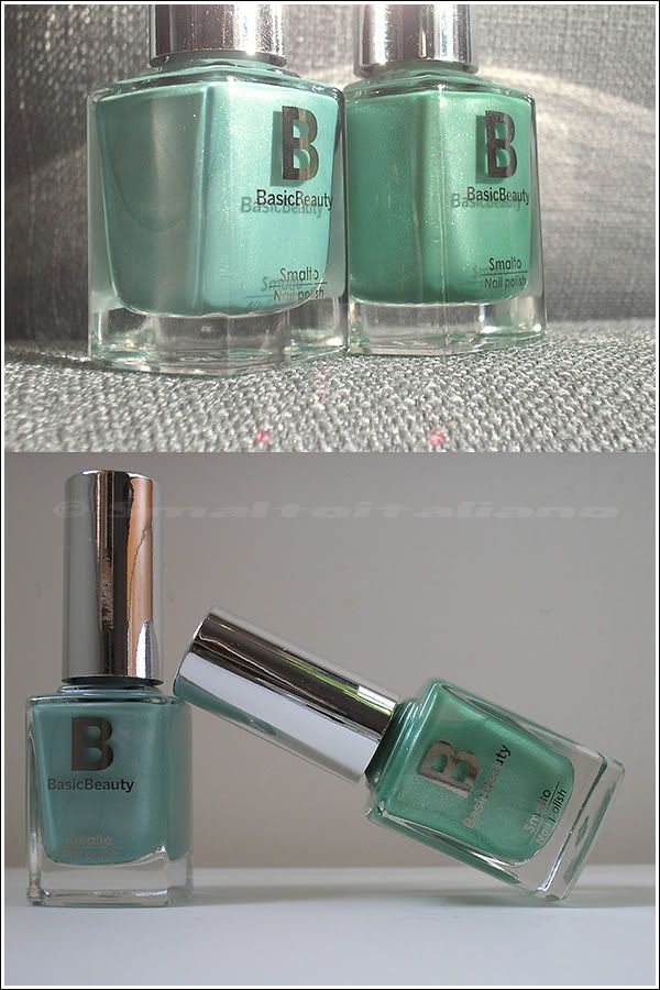
Let's see my new arrivals: Basic Beauty "published" some new colours, especially a LOT of greens, and I chose these two... mints? Well, one is definitely a mint, the other one is more of a spring leaf green:

(n. 03 on the left, n. 24 on the right)

N. 03 is a mint with the typical pearl-non pearl shimmer, lol, don't know if you understand what I mean :D
This type of shimmer softens the colour without making it look like an old streaking aged pearled nailpolish :P

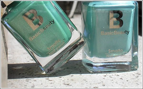
N. 24 is an interesting sweet shade of green with the same fine shimmer and it's spiced up with a fine green glitter not so evident, but noticeable and very nice, see it better in ther next pic:

(n. 24 on the left, n. 03 on the right)

I believed I already owned two colour like these, but it wasn't so, therefore I'm pleased I still have a right eye for new (to me) items :D


Have a nice day/night/whatever and thanks for your attention ;¬)
Kiko - n. 344 + Sinful Colors - Hottie + OPI - Significant Other Color

| | Comments: (11)

Hi all :>
Here you have my last try on layerings, not bad at all, I think.
As you can read from title, I layered two more polishes on this Kiko, because I wanted a less simple look.

Full sun:

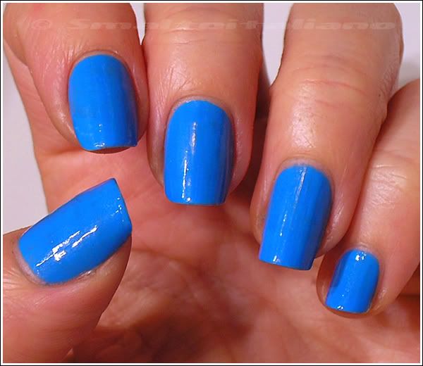
"Hottie" (one coat) gave sparkles and "SOC" (one coat) gave the green shimmer.
Daylight:

The characters:

I like it even in shade, and you can see the texture of "Hottie", seriously it has glitters of all shapes, even iridescent chunks, I like it.

Only flaw it's density: it's so full of sparkling stuff that its consistency is like glue, maybe I'll add some drops of thinner next time...

Shade:

"SOC" changes colour depending on the angle, it's a VERY nice green-pink duochrome!

... But beware of your own nails :D -.-°


EDIT about wear: this is a combo of three polishes, but it stayed perfect for three days about; today is the fourth day and I got two chips on thumbs, but other nails have just a little wear on tip, so... Good for me :>


Have a nice day/night/whatever and thanks for your attention ;¬)
Kiko - n. 344

| | Comments: (3)

Hi :>
Quick description this time, because it's a nailpolish creme, but it deserves a post on its own, because it's a great colour, even if not very original or unseen.

I call it a jade colour, more than a mint green, because it's a tad bluer than the classic "milk&mint" mix.
Maybe a liiiittle greener in real life, but you know well these kind of colours might confuse cameras...

Anyway, very nice formula, these are two easy coats without top coat because later I added two more layers of... Somethin' else :D
Glossy and leveled without problems.
I already compared it here with a well known nailpolish to show you differences :>


Have a nice day/night/whatever and thanks for your attention ;¬)
Comparisons: Essence, Deborah, H&M, Rimmel and Kiko

| | Comments: (6)

Uhmm, you know your collection is growing out too much when you can find in it similar items, especially after buying some new ones :^D
Maybe I should focus my wants just to my wishlist...
Anyway, three comparisons, hope they will be useful to someone out there!

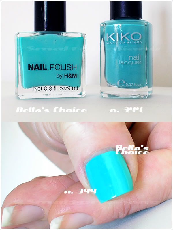
First one: H&M's "Bella's Choice" vs Kiko n. 344.
Even if these are all colours my camera gets crazy with, I think you can view subtle differences anyway.

Both two coats.
"Bella's Choice" is a little brighter, while n. 344 is dustier; same colour, though.


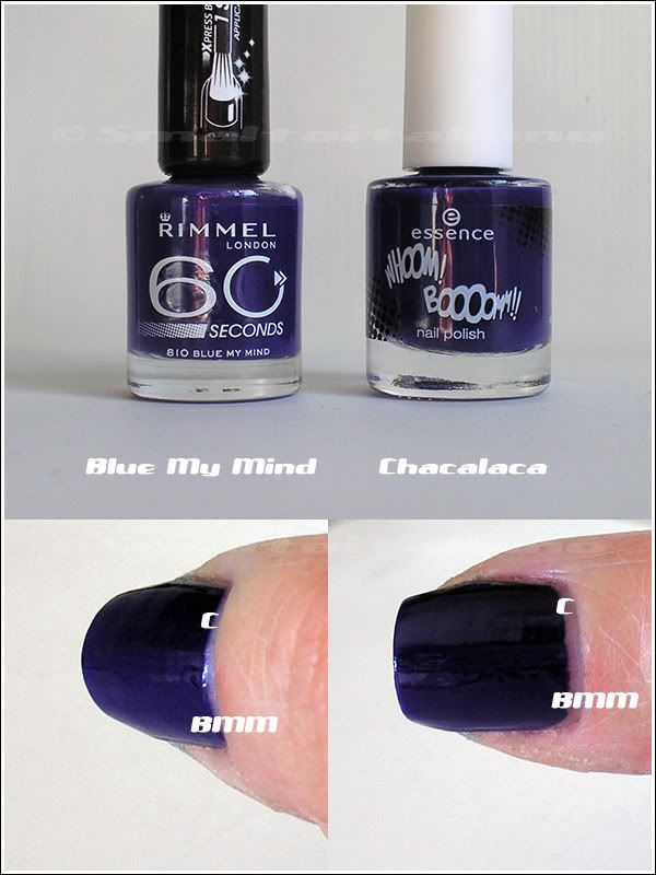
Second one: Rimmel "Blue My Mind" vs Essence "Chacalaca", strangely this time my camera captured colours very well!

It was VERY difficult to take pictures of them!
They're pretty the same colour, BUT "Chacalaca" contains a drop of indigo which makes it a liiiiiiiittle bluer than "Blue My Mind"; "Blue My Mind" looks like a true purple next to it, but this is more visible to the naked eye.

The ACTUAL difference is in the formula, because the Rimmel one took three coats, while "Chacalaca" is a one coater. Excellent!


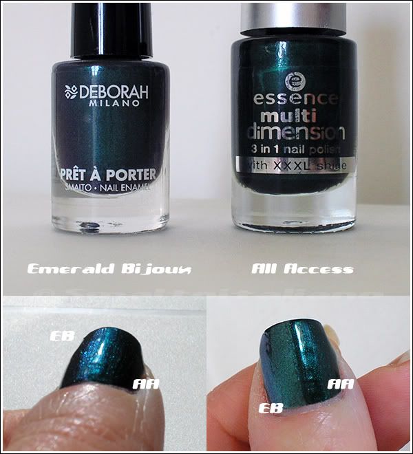
Third and last one: Deborah "Emerald Bijoux" and Essence "All Access":

Bottom left picture shows how they become blue in angled full sun.
Differences are more visible in real life, anyway: "Emerald Bijoux" is sheerer - took three coats - lighter, and more duochromy, while "All Access" is so dense - one coater again! (but I put two) - and definitely green, even if you can spy some duochrome reflects in the bottle (look my previous post).


Have a nice day/night/whatever and thanks for your attention ;¬)
Something new :>

| | Comments: (4)

Spring collections are everywhere finally, so I had the chance to get some nice new adds :>

From left:

- Deborah - Prêt à porter n. 25 "Emerald Bijoux", I'll talk about it later;

- Essence n. 57 "Can't Cheat On Me", a weak silver holo. I tried it on my boyfriend :D, but it took al least three coats (it's pretty watery, not patchy like the Gosh one) and holo effect is very subtle, even in sunlight.

- "Chacalaca" from the Whoom! Boooom!! collection, this is the only one colour I was interested in...

- ahem, Kiko n. 344, lightly dusted medium mint (more muted in real life).


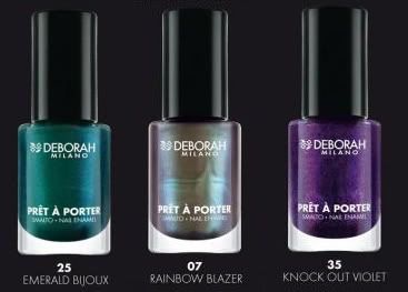
The first one is from a spring collection of new 40 shades by Deborah (Kiko too made 40 new colours, what's the secret meaning of 40? :^D), here you can check them all better.

A great choice for all tastes, but I only noticed three or four colours:

Here's the swatch of "Rainbow Blazer", it's really a strange duo-trichrome, but its base is a light brown so, not very flattering on me :^/
"Knock Out Violet" looks like Zoya's "Mimi", it's pretty.

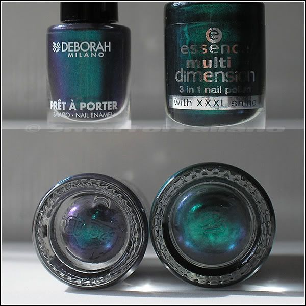
After buying "Emerald Bijoux", I compared it to Essence "All Access", since I noticed they're pretty similar:

They have the same duochrome side, but "All Access" is more dense and greener, while "Emerald Bijoux" is sheerer, has a dark grey base and it's in general more muted, even if I guess that duochrome is more visible on it when applied on nails than "All Access".

Maybe I'll swatch them side by side later :>


Have a nice day/night/whatever and thanks for your attention ;¬)
Number increasing...

| | Comments: (10)

... Number of my nailpolish bottles, of course :D
Here they are my new adds.

A couple of weeks ago Kiko decided to add 40 new shades to the regular collection of colours, but these new adds are limited editions, even if Kiko didn't communicate a "date of expiring", so I guess they'll sell them until stock runs out :D

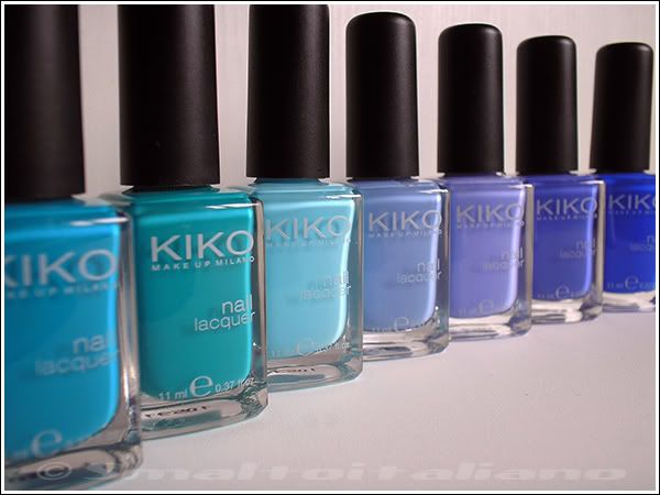
Given that new shades are primarily pinks, aquas, mints, dark blues and purples, I tried to GRAB my favourites from the group as soon as I could, and this is my haul:

N. 342, 341 (maybe I inverted first two, I don't know :D), 340, 339, 338, 337, 336.

Aaahh, these are all colours I wanted from long time!
I know they aren't particularly original, but italian world of nailpolish doesn't offer so many choice, especially from the cold side of rainbow, so I'm really happy with them :>

Camera took colours pretty faithful to reality, but I isolated drops from the Kiko's site* (in reverse order compared to my picture) to show you how they are, differences are subtles...


♥ ♥ ♥

(*) drops taken here.

It isn't finished yet!
Can you recognize them? :^D


Yeah, "Gemma" and "Caitlin"! How beautiful they are?


Have a nice day/night/whatever and thanks for your attention ;¬)