Essence - Where's The Party?

| | Comments: (8)

Hi :>
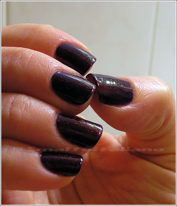
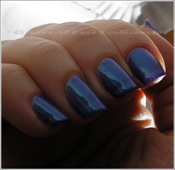
Here it is one of the most complex colour I've ever worn, it's very... undefined.
See for yourself:n
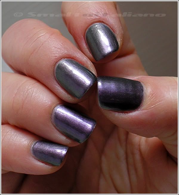
(daylight)

It has at least three colours in itself: lead grey, purple, green.
Sometimes you can see them all at once, sometimes one colour pops above the others.

For example, sun shows purple reflects:
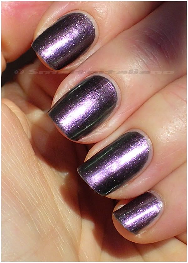
(green on the edges °_°)

... But purple is the king in daylight too, depending on the angle of the lighting :>
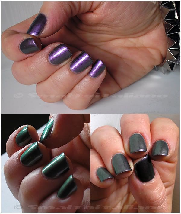
(purple on top, green on the left, grey on the right...)

I must admit that this colour it's prettier in real life, because colours are often visible all together; this could be a defect, though, so if you like changing shades, this one is for you :>

What about "Where's The Party?" under artificial light?
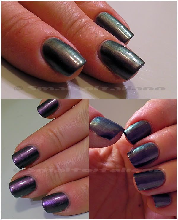
Gorgeous, isn't it?

Last, two shots in low daylight, the BEST for duo/multichrome:

I don't remember very well how many coats I used, surely two, maybe three? I just remember it's VERY pigmented, so I guess two good coats are enough.
It lasted my regular five-six days, so it's perfect formula wise too.

Just another thing: the day I was wearing "Where's The Party?" I saw the Gareth Pugh for MAC's collection, and the most coveted shade "Ascension"; well, don't know about you, but I asked for its price (just curiosity!) and it was something like €23 0________________0

Best part? I tried it on my thumb, just on a half of it:
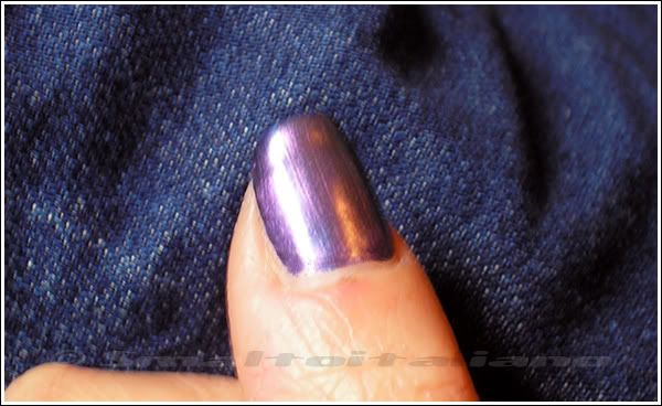
(which half, in your opinion? :^P )

Do you see any difference, any division line between "Ascension" and "Where's The Party?" It doesn't exist, these two colours were/are the same spitting shade, with the only difference in price (Essence is less than €2...).
Not bad, right? ;>


Have a nice day/night/whatever and thanks for your attention ;¬)

New buyings, a swap, a comparison...

| | Comments: (10)

Ok, this new posting layout is somewhat confusing and very stupid (I had to rewrite things tens of times, text options keep changin' themselves without any intervention by me!), but I'm trying to get used to it, because I guess it will be the definite one and the old one will disappear soon.
Then, I saw a lot of blogs with the new comments system why I don't have it? :^|

Anyway, in case you 're interested in new items, here are mines:


Kiko n. 03 (metallic-frost green) and n. 350 (champagne? I don't know...), two limited edition colours from two different makeup collections; they were on sale, so I grabbed them, together with the black Frozen one (not pictured).


These came from Switzerland!
A girl mad about duochromes asked for some Fontana Contarini she saw on my blog, and I sent her a handful of them; since Re-mix Your Style hasn't been released here in Italy, I asked her for some topcoats, and she managed to get me Love (detailed in picture) and Rock (*psst*, if you have the other two and want to sell them to me, my email is up to the left :D); but she was so kind and added an Accessorize purple nailpolish (n. 34) - they aren't sold in Italy, as usual :D - and a Misslyn n. 595, a German brand I suppose, not sold in Italy again.
As you can see, it's a gorgeous slightly duochrome blue = *__________*

Next, my last find: a new shade of Deborah Prêt à Porter, named "Carpe Diem".


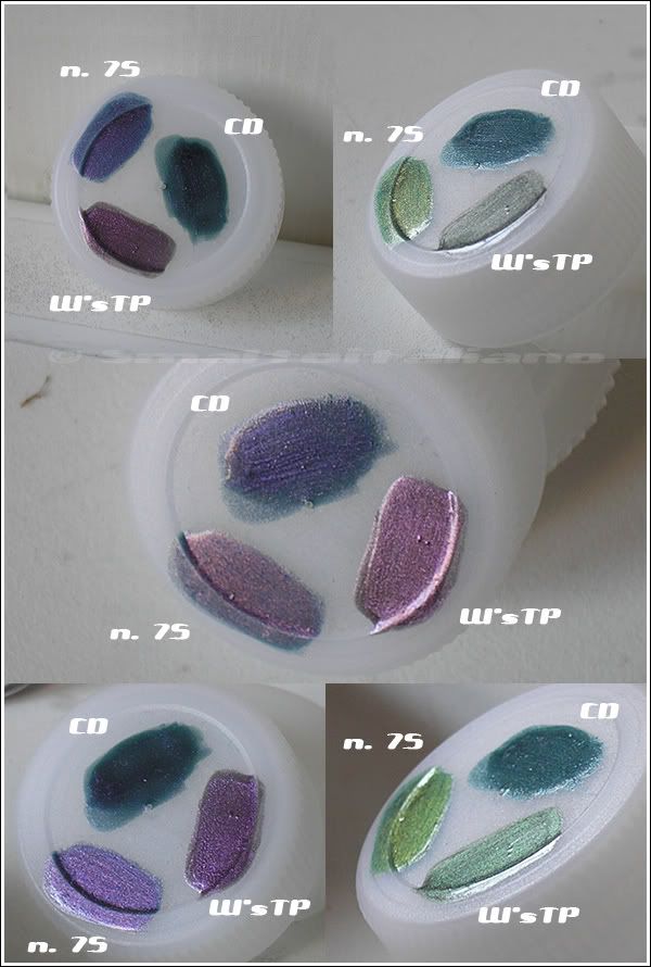
I compared it with other similar shades I already own: Fontana Contarini n. 75 (left) and Essence "Where's The Party?" (right), always on my trusted plastic bottles cap :D

(all two coats)

N. 75 is the most changing colour above all three, while "Carpe Diem" is the most pigmented.
Pretty nice, don't you think? Duochrome from a teal to a purple <3 <3


Have a nice day/night/whatever and thanks for your attention ;¬)

Kiko - n. 335 + Kiko - n. 354

| | Comments: (5)

Let's continue with Kiko, why not :D
As per the Layla row, these Kiko posts are absolutely genuine, as I publish posts in the same order as I wear my manicures...

Anyway, this was my last combo for 2011 (and the first of 2012, since that I'm still wearing it - chipped - while I'm writing - January 2nd!): festive enough, right?

(direct sun, the most true-to-life pic)

Next one is in daylight, LOVE it:

First of all, I took pictures with my new camera, but clearly I can't use it yet, I didn't like the final result so much... My skin looks made of plastic, they just look kind of washed out, white balance isn't the best... I don't know, any suggestion?
Meanwhile, I'll play with it, maybe it's just some option I have to focus on...

The actors:

One coat of n. 335, a blue jelly, way more dark in reality, and two coats of n. 354 *_*

Colours are pretty well pictured, even if these kind of blues/blurples may vary in different ligthings... but I still don't like how my skin appears here :^[

Nothing more to say, Kiko confirm itself :D


Have a nice day/night/whatever and thanks for your attention ;¬)

Kiko - n. 333 + BeYu - n. 209

| | Comments: (18)

Ok, THE king combo of the year (almost, I think my absolute favourite of 2011 is this one).

Thanks to the magnificent n. 209 from BeYu, I was able to recreate a Clarins 230 look-a-like, which is not bad since I will never get the original one...

Well, not just the BeYu, but a very great deep purple by Kiko helped me with this manicure.

I showed you n. 333 here, and you see now the deepness of this purple, so dark and saturated.
It's not a unique colour, but this is what we have in Italy, and considering it's a Kiko, you may know about its good quality, good brush, etc. :>

The main characters:

I took this picture in the dawn lighting, that's why it's so warm.
Pretty as well, eh?

We had sun the previous week before Christmas, but I was unable to take pictures in the open, so I tried to capture the green side of the shimmer... in my bathroom -.-
But it's there!

And here it is how it looks in artificial light, so sparkly and precious!

I liked this a LOT, you may have noticed it by the number of pictures :D

I applied two coats of n. 333 and two coats of n. 209; it was beautiful with just one coat of n. 209, but oh well... :D

The good BeYu (INCI 31) isn't that easy to find, but if you have a Douglas near you, I suggest trying several times searching for it and NOT giving up, because I was able to find other bottles to send out to some girls who requested it.
Remember this colour it's part of the BeYu regular range, it's NOT a limited edition :>

The purple Kiko is a creme, not a jelly one, but that's ok, I guess I'll use it for other interesting layerings such this one.


Have a nice day/night/whatever and thanks for your attention ;¬)

Kiko - n. 342

| | Comments: (5)

Hello everybody!
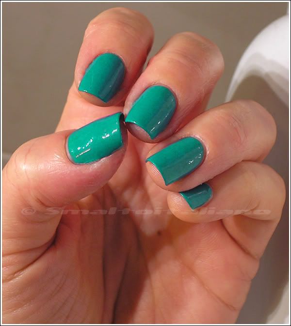
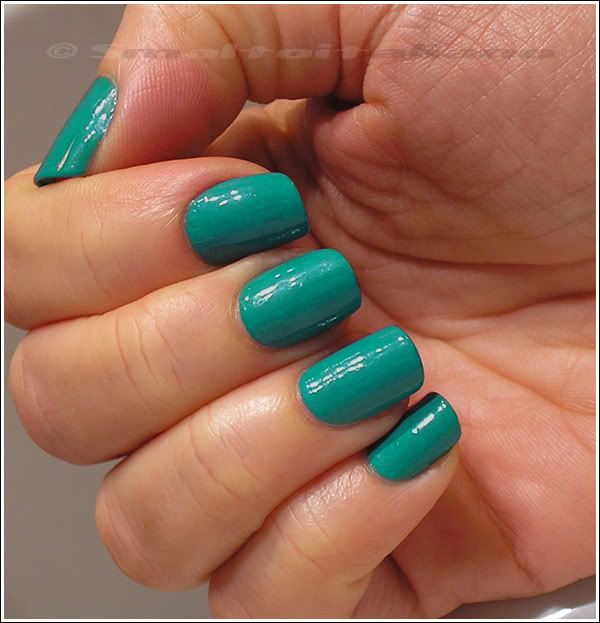
First post of 2012 is a green, a hope green: fits perfectly today, don't you think? :>

Unfortunately I only got few pictures in artificial light, as that week it was always bad weather and such...
But they return pretty well the colour, even if in real life maybe it's a little dustier and not so bright (just a little!)

Simple malachite green creme, it changes under different lightings. You now how it works with teals and tertiary shades ;>

PERFECT coverage in two coats, Kiko definitely shows its best with cremes :>


Happy new year to everyone who's reading, have a nice day/night/whatever and thanks for your attention ;¬)
Ados - n. 579

| | Comments: (6)

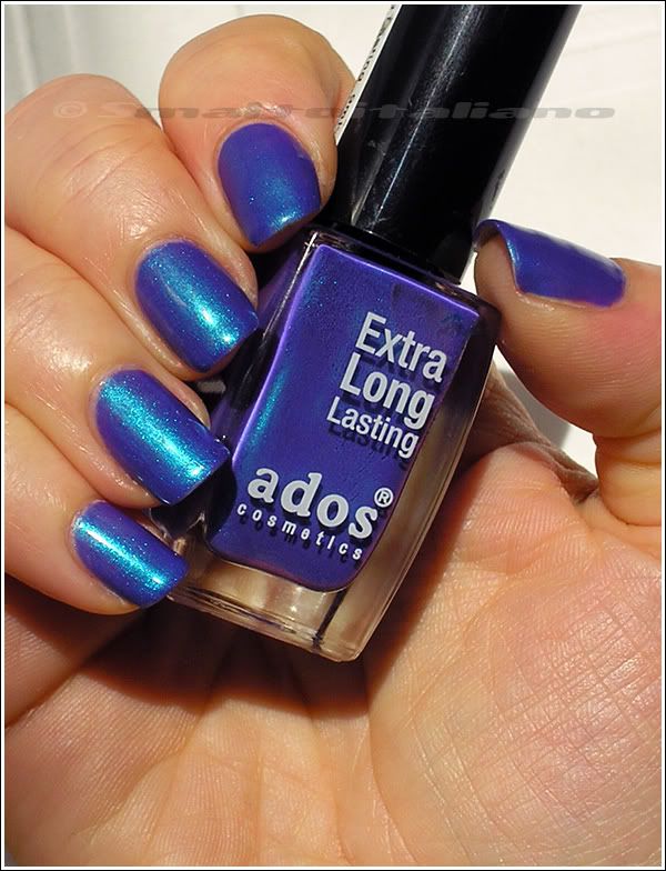
Hands down to this BEAUTIFUL gem from my first swap with Sabbatha!

Do I really need to describe it?

Three coats of this stunning blurple-with-turquoise-shimmer precious shade are on my nails (plus a coat of Better Than Gel Nails top coat).

I remember I thinked about RBL's "Scrangie" when I first saw this Ados, but I don't know how much they're similar.
Nothing bad, as I LOVE n. 579!

I'm glad we had sun those days (rare thing here in Milan during winter!), look at the colours!

Sorry for the image bombing.

Look at it when in shade too *_________________*
Subtly duochrome shimmer, but I even wanted to show you how the Better Than Gel Nails top coat makes my nails smooth and... polished :D

Straight in my favourites!


Have a nice day/night/whatever and thanks for your attention ;¬)

Sinful Colors - Dream On

| | Comments: (6)

Sinful Colors, why are you so expensive in Italy?
€4,90, but I always wanted this magic purple, so finally I bought it.

And I'm glad I did it!

WARNING: this is NOT as you see here, it's much more dark and BRIGHT, and you won't find a true-to-reality picture on the web, I can swear it :D

My best picture of "Dream On" is the next one, taken in artificial light, so, again, colour it's not really this one...

"Dream On" it's not so pink, not so cool, not so light... I don't know how to describe it, please see it with your own eyes :D
In general, I can say it's the same colour of some species of Bouganvillea, VERY bright, I always liked those flowers (ok, they're not flowers, they're leaves, but that's ok :D).

It's a true neon purple nailpolish, so it dries absolutely matte and in few nanoseconds -.-
I applied three coats.

See how much it's glossy? Here I topped it with the Better Than Gel Nails top coat from Essence: GREAT glossiness, but after two three days my naisl were already chipped a little...
I must say they remained glossy after one week too, an effect I don't get with regular clear nailpolish.
Oh well, I'm curious to use that top coat on top of glittery and sparkly things :D


Have a nice day/night/whatever and thanks for your attention ;¬)

New arrivals... including a special one :D

| | Comments: (17)

Yeah, november buyings...
This time I included a very special one, you'll see "it" later :D

Do you remember the Fontana Contarini polishes?
Last week I purchased some for a girl who saw my posts and wanted the duochromes, so while there I snatched a couple (well, more than a couple :D ) for me too :P

From upper left:

- n. 76, strong amber/pink copper duochrome.

- n. X (doesn't have any sticker on), it's a clear base infused with irregular shaped glitters - like microflakies - old gold coloured, very beautiful.

- n. X again, darkest teal jelly *_*

- n. 51, it's something like China Glaze's "White Cap", but its glitters are soo tiny and multicoloured, I spied gold, orange and green... We'll see them better when I'll wear it :>

- n. 65, STRONG duochrome from lime green to orange/pink <3 Imagine it over black...

Above, a picture in the sun (yeah, SUN!) and, below, the duochrome of n. 65: isn' it beautiful?

At first, it reminded me of "Prism@tic White", but fortunately n. 65 it's much more sheer, not pearly/milky at all, so it's great for layerings :>


Then, a new Layla Ceramic Effect, a blue one with tiny silvery white glitters, and "Old Gold Buffy" from the Essence's Vampire Love TE.
Seems like I'm in the mood of old goldy shades.

Last from Essence, base and top coat from their Better Than Gel Nails range.

I already used the top coat a couple of times, and the base coat one time, because I didn't have time to do a full coloured manicure, but I'm not completely satisfied at the moment, especially with the top coat: it makes may nails so shiny for all the week, but it's way less durable than my regular clear varnish top coat, I got chips I never usually get after only two or three days of wearing...


Well, it's the moment of our (me and my boyfriend) special new "buying" - no, I didn't buy it :D
We got it one week ago...

This is Coal :D
Black male Maine Coon, positive FIV, one year old, he's born on November 1th *_______________*

I'm in love, it's my dream cat <3 :D


Have a nice day/night/whatever and thanks for your attention ;¬)

Revlon - Emerald City + Zoya - Edyta + Gosh - Rainbow

| | Comments: (9)

... And here it is "Emerald City" a little revamped :D

These are very dark days, weather wise, so I wanted something sparkly. I mostly wear black clothes, so I think this was a good idea to bring a little touch of light on me :>

This is a simple sponge design, just done with two colours. The actors:

First, I sponged "Edyta", which I'm in love with *_* What a great shade of olive sparkly green!

Then, I applied "Rainbow" by Gosh... well, you know it :D

Not much to say more about these gorgeous colours, they're beautiful on their own AND combined together :>


Have a nice day/night/whatever and thanks for your attention ;¬)

Revlon - Emerald City

| | Comments: (9)

Long time no post, hi all!

This has beeen a very long week, but at last I made it and here I'm catchin' up with colours ;>

This was a nailpolish I wanted for a long time, then, thanks to Sabbatha, I got it quickly without any worries: at that time I couldn't find any Revlon shades but the boring reds, pinks and pearly nudes...

Though I don't wear mattes (I tried them, and didn't like the result, I think with mattes you must have PERFECT nails), I decided to try this and then to layer over it one coat of top coat: what a beauty!


First of all, if you din't own it, I have to underline the perfect formula, it's like zabaione! (a mixture of egg yolks and sugar)
It lays on the surface of nail evenly and without flooding towards cuticules, never experienced something like that!

Plus, colour is rich, and being a matte, dries faster than acetone on your skin :D
I applied it before going to bed, it was already past midnight, and I did it all in half an hour, two QUICKLY coats.

I LOVED the subtly grainy texture: with just one coat of topcoat, you'll obtain a leather-like surface, NOT a glass effect, look at the pictures :>

Now that these Revlon are available in Italy too, I suggest looking for them, and this one won't left you disappointed, it's a rich forest green very cozy and a great option for autumn colours, other than the reds, coppers and golds :>


Have a nice day/night/whatever and thanks for your attention ;¬)