Kiko n. 245 + Essence - Glisten Up!

| | Comments: (6)

Hi all :>
Finally I managed to finish this post! I had it in my drafts section for days and days, because I needed the last picture, then had to upload it and edit it...

So, another meh-mani: as you can see in my last pic, Kiko n. 245 alone seems gorgeous, and one of the feeeew reds I own, but once on nails it appears just like a common vampy burgundy red with a tiny hint of shimmer, absolutely WITHOUT that goldish-green rainbowy veins you see in bottle.
I imagined a stunning combination of that shimmer with the flakies of "Glisten Up!", but result was similar to a simple flakies-over-black...

I took photos indoor, but I didn't succeed in capture the red on its own, all pic turned horrible :^/
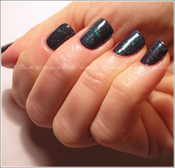
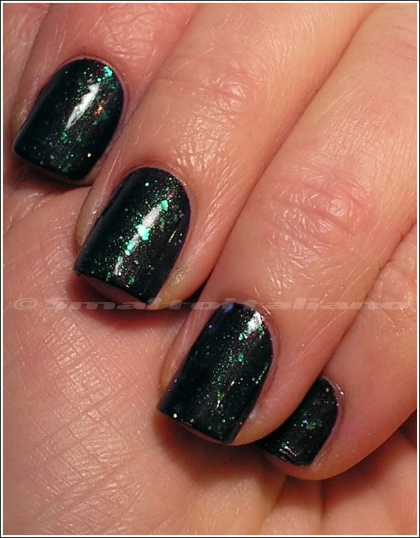

Look at it, sigh.


Maybe do I have to try it in summer? Unfortunately, I doubt it will never show more than a faint shimmer.


Have a nice day/night/whatever and thanks for your attention ;¬)

A little trip to Bruxelles...

| | Comments: (2)

... to buy me some polish I cannot find in Italy :^D

Truth is that, while visiting Bruxelles, I saw that chain of markets named Kruidvat I read about in some dutch and french nailblogs.
I knew it sells some brands unavailable here in Italy, so I took the chance to bring some shades home which were on my wishlist :>


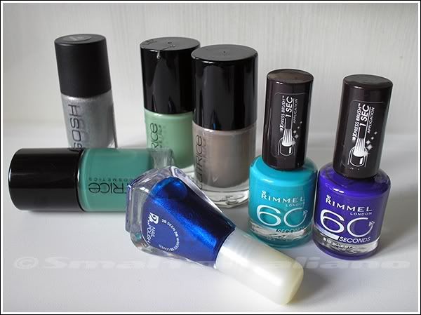
Gosh "Holographic" (see you in spring/summer :D), Catrice "I Sea You", "Sold Out Forever" and "Clay-ton, My Hero"; then, a shimmery blue by 2B (never heard of that brand before, it costed me less than €4) - totally dupe of these blues, I know... Why did I buy it?

And those two Rimmels I really wanted, "Sky High" (it's a little darker in reality) and "Blue My Mind": see how... blurple is it? :^D


Have a nice day/night/whatever and thanks for your attention ;¬)
H&M - Miss Stone Heart + Essence - Glisten Up!

| | Comments: (4)

A meh-look, this time...

Ok, I don't like grey on me: clothes, make-up, polish... It simply doesn't goes well with my yellowy-olive skin.
I used to use grey in make-up and some garment, but I soon decided it's not a colour of mine.

But after seeing this grey creme in a H&M's shop, a brilliant idea came in my mind: add some H&M's "Blue My Mind" and make this concrete grey sort of a muted periwinkle, or a pale pale blurple...
Lol, it remains dramatically grey after a lot of "Blue My Mind" - not so much, but I thought I would have used less of it; but one day I decided to wear it anyway, with a little plus of awesomeness on top: "Glisten Up!".

I didn't like the result too much, plus the grey bubbled on some nails - and I'm not the only one. Nothing too noticeable, because the sparse holo glitter in "Glisten Up!" hide some of the bubbles.

Grey on nails is a little cooler than in the bottle because "Glisten Up!" is a light-blue-jelly with flakies, so it modifies colour of polishes...


Unfortunately I had to take pictures under articial lights, because it was early in the morning (= night), so you can see it can change a little, becoming warmer and much more cuter, to me at least :D


Have a nice day/night/whatever and thanks for your attention ;¬)

Fontana Contarini - n. 75

| | Comments: (6)

Good-dunnowhat!

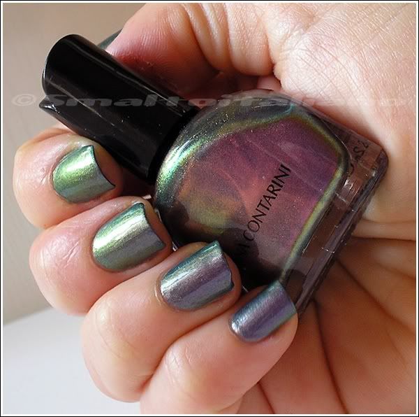
Finally, around mid december, I wore that AWESOME FC duochrome :>
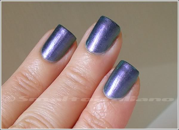
Not much to say about this one, see for yourself how much it changes from various angles and with different lights.
See the rainbow?


Here it's totally purple!


Mossy tealy green:


Duochrome in action on sides:


Last one is under an artificial light, purple, but warmer:


Two not-too-thin coats cover well, I don't have really anything more to say, obviously it's now one of my favourites (how many times I write this sentence?), that's why I bought two bottles of it ;>


Have a nice day/night/whatever and thanks for your attention ;¬)

Nubar - Reclaim

| | Comments: (7)

Welcome to 2011 and welcome back to my nail polish log :>
I had to work hard during december, so I didn't have any time (and strenght!) to edit and post pictures, but I took them of every change of polish, so now that I have more time I'll continue with my... mission: register all my colours, in order to avoid repeated buyings and/or dupes; plus, it will help me to know which shades I prefer/I wear most of the times.

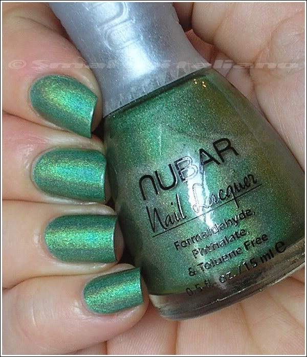
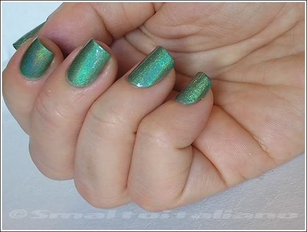
This is "Reclaim" by Nubar, and I can say this is one of my favourites, not just for his colour, not just for the holoness (is that a word? :¬D), but for its formula too: it's p e r f e c t, with a careful application you won't need any clean-up.


The day I wore this, sun was sleeping behind clouds, but look, its rainbow it still visible and so crisp! I didn't applied top coat.


I didn't even had to retouch colour balance or contrast on these pics, they came out perfect and really natural :^]


Wear: two or three days. I worked with hands too, so this affected the wear pretty hard, but I can assure you it's a really good polish, so easy to apply yet durable when it dries.


Have a nice day/night/whatever and thanks for your attention ;¬)
Too much...

| | Comments: (2)

... work in december!
I can barely visit my favourite nailgirls, but I still have to wait in order to post something I would call "interesting"...

Happy holidays to you all!

Comparison: H&M "Spending Cash with Carl" vs Fontana Contarini n. 85 vs Basic Beauty n. 67 (vs an old unknown Kiko)

| | Comments: (6)

Good whatyouwant :>

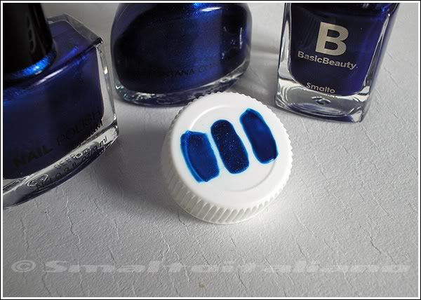
Recently I realized I own various colours who look very similar each other, so I decided to do a quick "cap-test" and see how much they're similar.
These are all blues who have a purple/blurple edge around the bottle, if you know what I mean...

From left, H&M, Fontana Contarini, Basic Beauty. First pic is just one coat:


As you can see, Fontana Contarini covers very well, has a deeper base and microglitter. I read somewhere that H&M would be a one coater, but I disagree, it's the thinnest of all three and surely require two coats at least. The Basic Beauty one is a tad darker than H&M.

Next pic shows two coats:


H&M is the lightest - even if the colour is the same -, Fontana Contarini is perfectly opaque and Basic Beauty is dark as well, but it's the flattest too, as it hasn't too much depth.
I wore n. 67 in the past (you can take a look here): it's not bad, but I think that FC would look better on nails. See the microglitter?

Then, I saw another polish which is very close to these blues, so I painted it too next to others, to see differences. This is an old Kiko, I can't find the number on the label, one coat:


And two coats:


It's difficult to capture differences with camera, given that they're all almost dupes each other, so I tried a different angle, and here you can see that H&M and FC contain a shimmer much more visible and vivid than the others (but FC is more opaque, I prefer it over all); Kiko and BB are dupes.


Have a nice day/night/whatever and thanks for your attention ;¬)
Collistar - Viola Glitter

| | Comments: (5)

Good what-you-want :>
Unfortunately, these days I cannot take good pics, because I'm at home - my boyfriend's house has better spots :D -, so I'm not completely satisfied with them, but I need this blog to help me making an archive of my polishes, what I have and what I wear :>

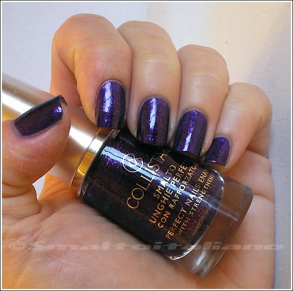
This time I'm wearing "Viola Glitter", a blurple jelly base full of pink microglitter; I guess it's very similar to Milani's "Totally Cool", but I don't have it and I can't compare them.
These are three coats: it dries fast and it's super foily, but one coat of top coat enhance glitters and makes base colour deeper and darker.


I love it, but I wish I would have taken more pictures of it, it's a beautiful vampy-glam purple. Probably, next time I'll wear it, I'll take better photos :>


Have a nice day/night/whatever and thanks for your attention ;¬)

Looong nails

| | Comments: (7)

Surfing the web - again - I came accross this site, which is devoted to extreme lenght for nails, on hands and toes.

Sure that everybody choose their own style, and I'm happy if those womens are able to do anything they like without problems, but I still don't get how nails like these could be sexy:


They're fake, different from each other and the shape... C'mon, it's like having shoehorns on your fingers.
Take a look, some toenails are freakish as well.

I know we have Guinness World Records, and I know what fetishisms are, but still I don't understand how such exaggerations can be considered beautiful and attractive; if nails like these are fake too, I don't even see a merit of wearing them.

What's the point of having a stupid design on your tips? Maybe it's just a cultural lack of mine - or maybe it's not mine.


Have a nice day/night/whatever and thanks for your attention ;¬)

Sinful Colors - Mint Candy Apple

| | Comments: (5)

Quick post today :>
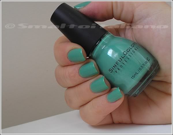
I've just removed this from my nails - time to change already -, but I have one pic of this beautiful polish: "Mint Candy Apple" is smooth, it takes two coats to cover nails and it's the perfect soft mint shade with the tiniest silver shimmer you need even in winter, it's a refreshing shade, and a little vintage-y with its dusty feeling :>


EDIT about wear: no chips after 5 days, just tipwear, very good behaviour!


Have a nice day/night/whatever and thanks for your attention ;¬)